!J.O.O.E.!
Account deleted |
!J.O.O.E.!
Account deleted
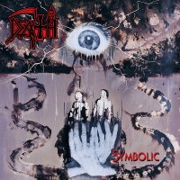
It's ok. Kind of nice from an aesthetic point of view, ugly as sin from a subject matter perspective though.
Loading...
|
Troy Killjoy
perfunctionist
StaffPosts: 21306  |
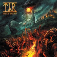
Probably one of their best covers, although that isn't saying much.
----
"Wise men talk because they have something to say; fools because they have to say something."
Loading...
|
X-Ray Rod
Skandino
StaffPosts: 18274  |
Written by Guest on 17.04.2014 at 16:56
Kind of nice from an aesthetic point of view, ugly as sin from a subject matter perspective though.
I don't understand what you wrote. D:
----
Written by BloodTears on 19.08.2011 at 18:29
Like you could kiss my ass Written by Milena on 20.06.2012 at 10:49
Rod, let me love you.
Loading...
|
!J.O.O.E.!
Account deleted |
!J.O.O.E.!
Account deleted
Written by X-Ray Rod on 17.04.2014 at 17:25
I don't understand what you wrote. D:
I meant that the design style is nice, but the actual picture, the warped head thing, is fugly =P
Loading...
|
Cynic Metalhead
Paisa Vich Nasha
Posts: 6815  |
It'll look good on CD cover.
Loading...
|
BloodJuNkie
Of Egypt
Posts: 643  |
Better than the crow on SOAPF IMO!
Loading...
|
s_t_s
Posts: 1208  |
Written by BloodJuNkie on 17.04.2014 at 17:50
Better than the crow on SOAPF IMO!
A matser of taste, I like that crow  That CD artwork is nice too but what matters most is the content of the album 
Loading...
|
BloodJuNkie
Of Egypt
Posts: 643 |
Written by s_t_s on 17.04.2014 at 18:15
Written by BloodJuNkie on 17.04.2014 at 17:50
Better than the crow on SOAPF IMO!
A matter of taste, I like that crow That CD artwork is nice too but what matters most is the content of the album
Well, i'm not very optimistic to be honest  .. I just hope it be better than their last 2 releases!
Loading...
|
jesterhead57
Posts: 24  |
Wow! They went back to their previous band logo, that's a shock. Actually interested in hearing this now.
Loading...
|
Lord_Agony
Posts: 89
|
Awesome cover, i don't know what it means but it looks beautiful
Loading...
|
Mattybu
Posts: 2589 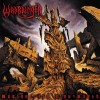 |
Written by jesterhead57 on 17.04.2014 at 19:10
Wow! They went back to their previous band logo, that's a shock. Actually interested in hearing this now.
Could you really call that a logo? As much as the type face for the last sentence I typed could be a logo for a band called "Could you really call that a logo", if you get what I mean...
As far as my thoughts on the artwork, it looks pretty run of the mill to me. Not very interesting.
Loading...
|
jesterhead57
Posts: 24 |
Written by Mattybu on 17.04.2014 at 20:01
Could you really call that a logo? As much as the type face for the last sentence I typed could be a logo for a band called "Could you really call that a logo", if you get what I mean...
I don't think logos require a certain level of complexity to be considered logos. But, I see what you mean. I like this logo much better than the one they used on "A Sense of Purpose" and "Sounds of a Playground Fading".
Loading...
|
Mattybu
Posts: 2589 |
Written by jesterhead57 on 17.04.2014 at 20:14
Written by Mattybu on 17.04.2014 at 20:01
Could you really call that a logo? As much as the type face for the last sentence I typed could be a logo for a band called "Could you really call that a logo", if you get what I mean...
I don't think logos require a certain level of complexity to be considered logos. But, I see what you mean. I like this logo much better than the one they used on "A Sense of Purpose" and "Sounds of a Playground Fading".
Well I agree they don't necessarily need complexity. A lot actually suffer from trying to be too complex. I personally think it needs to be a little more unique than a font off microsoft word to form an affiliation with a particular band though, haha. Agreed about the other logo though, always got a crappy teen angst vibe from that one.
Loading...
|
unswabbed
Posts: 25  |
Certainly the most beautiful cover for their album, it's simple but effective
Loading...
|
snake? snaaaake!
Account deleted |
snake? snaaaake!
Account deleted
I hope someone genuinely hacks their website now. I genuinely can't stand marketing tricks like that.
Loading...
|
Ace Frawley
The Spaceman
Posts: 1458  |
Written by Guest on 17.04.2014 at 17:37
I meant that the design style is nice, but the actual picture, the warped head thing, is fugly =P
hahaha, yep, agree with that. Fugly is the word. Might have been nice if the warped head thing was a sexy-looking siren instead.
----
The sun shines over The Fool...
Loading...
|
!J.O.O.E.!
Account deleted |
!J.O.O.E.!
Account deleted
Written by Ace Frawley on 17.04.2014 at 23:59
hahaha, yep, agree with that. Fugly is the word. Might have been nice if the warped head thing was a sexy-looking siren instead.
That would have been my preference too. I suppose though sirens are supposed to be ugly only they fog the minds of sailors into thinking they're hot, or something. Still though, I'd rather have my mind fogged i think.
Loading...
|
!J.O.O.E.!
Account deleted |
!J.O.O.E.!
Account deleted
Written by Guest on 18.04.2014 at 07:46
Is it sad that it reminded of Demon of Song?
Haha, Demon of Song is perhaps a little better looking than that thing 
Loading...
|
jesterhead57
Posts: 24 |
Written by Mattybu on 17.04.2014 at 23:06
Well I agree they don't necessarily need complexity. A lot actually suffer from trying to be too complex. I personally think it needs to be a little more unique than a font off microsoft word to form an affiliation with a particular band though, haha. Agreed about the other logo though, always got a crappy teen angst vibe from that one.
Lets just hope the music follows suit!
Loading...
|
Sang Dalang Abu
Posts: 1008 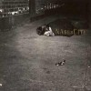 |
Not Bad.. 
Loading...
|
Opethian
Posts: 1729  |
Like it. Waiting for some music now
Loading...
|
Lord_Agony
Posts: 89
|
Written by Guest on 17.04.2014 at 22:49
Written by Lord_Agony on 17.04.2014 at 19:21
Awesome cover, i don't know what it means but it looks beautiful
I think, it depicts a siren, it reminds me of Come Clarity though, probably it's from the same artist.
Come clarity was done by Derek Hess, i'm not sure about this one but it doesn't have his style
I have this theory that their covers don't mean a thing, they just keep you wondering
Loading...
|
Sword_Chant
Posts: 714
|
I'm not hating on the band, but the last two releases I really struggled to get into. I'm not slating their new material, as there are parts I enjoy, but I really do prefer the style of their earlier works. So I won't be raising my hopes too high for this album, the cover looks good, but really the songwriting and direction matters just as much
Loading...
|
Fallen Ghost
Craft Beer Geek
Posts: 710  |
Looks like something from Come Clarity IMO
Loading...
|
Reaper_Redeemer
Posts: 743  |
Written by Guest on 17.04.2014 at 16:56
It's ok. Kind of nice from an aesthetic point of view, ugly as sin from a subject matter perspective though.
This comment was right into the point. Well-written.
Loading...
|