Gear is perfectly fine for small incline. I park that way at home for 16 years. And I don't park on steep incline anyway, nobody should unless no other way.
Opeth have finally revealed today the album artwork of Pale Communion, their anticipated new release. It was once again created by Travis Smith with art direction by Mikael Åkerfeldt. The album was pushed back to August 26th and the pre-orders will be up on Roadrunner's web store and on Opeth's official merch store next week, June 3rd. As of now, you can take a look at the album cover right here. Do you like it?
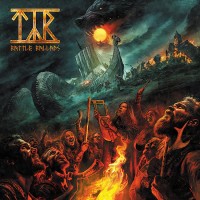
Tracklist:
01. Eternal Rains Will Come
02. Cusp Of Eternity
03. Moon Above, Sun Below
04. Elysian Woes
05. Goblin
06. River
07. Voice Of Treason
08. Faith in Others
It instantly made me think of the most famous 'picture hanging on a wall' album cover of all time - Led Zeppelin's fourth album. I know this one has three pictures instead of one, and an engraved gold plaque underneath, but there is a resemblance in style. I actually don't mind this cover.
I don't care a f**ck the cover while the music is good... Hope this new album crushes Heritage, this not being a difficult aim though.
Anyway, the cover is not bad, but the light effect ruins it a little
----
Twelve voices were shouting in anger, and they were all alike. The creatures outside looked from pig to man, and from man to pig, and from pig to man again; but already it was impossible to say which was which.
Mikael should stop using this artist for his albums. It's kind of a cool concept, but it looks sorta crap as an album cover. I miss when the art was actually pretty cool looking, like with Still Life, Blackwater Park, Ghost Reveries, or Watershed.
Doesn't matter though. What's mainly important about the album is what it sounds like. If it ends up being good, I guess I won't be giving much a shit about whether or not the album art is good.
... I was surprised to see all the comments trashing the cover. o_o
Not only do I think it's awesome, but it's also waaaaay better than Heritage's album cover... which WAS shitty. The idea of the band members heads as fruit utterly DESTROYED what would have been a good cover.
Anyway, I still think the album is likely to suck if it's like Heritage.
It instantly made me think of the most famous 'picture hanging on a wall' album cover of all time - Led Zeppelin's fourth album. I know this one has three pictures instead of one, and an engraved gold plaque underneath, but there is a resemblance in style. I actually don't mind this cover.
The Zeppelin one is at a whole different level, though. Oddly enough I didn't draw that connection but I can see where you are coming from for sure.
... I was surprised to see all the comments trashing the cover. o_o
Not only do I think it's awesome, but it's also waaaaay better than Heritage's album cover... which WAS shitty. The idea of the band members heads as fruit utterly DESTROYED what would have been a good cover.
Anyway, I still think the album is likely to suck if it's like Heritage.
Am I the only one who noticed that June 3rd is not Friday, but rather Tuesday? I wonder, if it's a simple mistake or Roadrunner tries to put the album in the veil of mysteriousness.
As for the cover... I rather like it. Now it will depend on how good does it fit the music.
----
"And we are not who we think we are
We are who we're afraid to be"
- Lux Occulta "The Opening of Eleventh Sephirah"
Agree with some of the comments above...The pictures hanging on the wall look nice enough, its the damn lighting effect that makes this look like something slapped together in Microsoft office.
Jesus. I hope the album is at least interesting this time.
---- "I got a lot of really good ideas, problem is, most of them suck."
- George Carlin
You must not read up on the latest Opeth news. Akerfeldt has stated numerous times the reason for the direction they've taken.
True. I have stopped following opeth news but just checked out the track to know how their sound has become after Heritage. The only latest news I've read about them is when he said that if Heritage resmebled 70'd prog rock this one would is be in the style of 80's hard rock. And since they've announced this won't contain no harsh vocals, I lost interest to read their interviews to further hear their justifications for the change and will just check out record when it's out.
Damn, that's quite badly done. Heritage had nice artwork, this one, not so much. I don't know what they were thinking. Maybe they're just trolling people. Everyone went ape shit with the last album and most people are probably going to hate the art on this one.
As someone said earlier, they should have just used one of the illustrations inside the frame as the full artwork. The one on the right looks pretty cool actually
----
If you never wake up from a dream does it become reality?
Don't see why this one is getting so much hatred. I love everything about it: the concept, the paintings and also the pretty unnatural color scheme and light.
---- I am the Magician and the Exorcist. I am the axle of the wheel, and the cube in the circle. “Come unto me” is a foolish word: for it is I that go.
Even though Opeth is one of my favorite bands (well, they used to be)...I have to say that this album cover is very boring, and so is that new track. Very disappointing. I guess they have given up being a great prog metal metal band to be a mediocre prog rock band. What a shame.
...if Heritage resmebled 70'd prog rock this one would is be in the style of 80's hard rock.
Now I only hope they will continue this way, with the next album sounding like 90s death metal. I've almost given up all hope on this one after hearing the leaked track.


 As for the Art work its irrelevant.