arwestromen
Posts: 645  |
I voted for the top logo because that looks similar to the viking alphabet...the bottom logo looks moore like Germany during WWII
----
Don't fuck with sweden
We gave you IKEA
Loading...
|
Paganblood
The Aryaputra
Posts: 1194 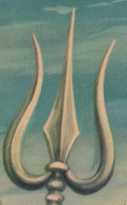 |
 I don't know what's the problem, but the images didn't show up.
----
that which shines without names and forms...
Loading...
|
Xtreme Jax
Psycroptipath
Posts: 2322  |
Written by Paganblood on 20.01.2007 at 15:45
I don't know what's the problem, but the images didn't show up.
Try again, your screen might not of loaded correctly because I can still see them.
----
Hellcunt Smurf
Loading...
|
Samuel
Hamster wheel
Posts: 1543  |
SamuelHamster wheelPosts: 1543
The Bottom one i guess... but id change the name... to like Thrudvangar or something... if thats not already a band
the top logo looks kind of preschool
Loading...
|
Paganblood
The Aryaputra
Posts: 1194 |
Written by Xtreme Jax on 20.01.2007 at 16:12
Written by Paganblood on 20.01.2007 at 15:45
I don't know what's the problem, but the images didn't show up.
Try again, your screen might not of loaded correctly because I can still see them.
Oh yes, they showed up this time. WEll, both are better and are worthy to be used, but since the first one resembles the ancient runic scripts, I think it will suit the band's ideology/style better. So, I recommend the first one.
----
that which shines without names and forms...
Loading...
|
Paganblood
The Aryaputra
Posts: 1194 |
btw best of luck to your band! 
----
that which shines without names and forms...
Loading...
|
Himann
Orm KrigGud
Posts: 1859  |
Well comparatively the bottom logo but neither are all that good. Try to be a bit more original perhaps and try to make it a bit more complicated too.
----
To be Draped by the Shadow of your Morbid Palace. Ohh, Hate Living...The only heat is warm blood
So Pure... So Cold
Transilvanian Hunger
Loading...
|
Zenzero
Zenzero
Posts: 472  |
top logo is more original!!!!!
Loading...
|
lazarus
Posts: 352  |
The first one looks better than the other one, it resembles the viking style well
----
And sometimes I despair
At who I've become
I have to come to terms
With what I've done
Loading...
|
APOHAKC
The Bard
Posts: 3585 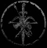 |
Honestly man I suggest you to make onther one, it is not very orginal to make runic logo, many done that already and it is totaly out, the same story about second one, it is nothing new and I think all of us have some similar font on computer. Of cause if you like them you shouldn't care about my or someone else opinion but causeyou posted this thread I doubt you don't care.
There are many great artist here on metal storm and i am sure some of them will be more than glad to help you with the logo thing.
And good luck with your band
----
They say that we are gone but I can't let you down
The heathen faith will rise again we won't fail now
I know we cannot die forever is our time
Give my people back to me free from Christianity!!!!
Loading...
|
FabricationError
Account deleted |
FabricationError
Account deleted
The second one is better I think, it looks more professional and made me feel that your line of the music is hard like stone and you know what to do....And first logo made me feel that you're just another amateur band which will be forgotten....but second one doesn't have anything original...If I were you I would do another logo 
Loading...
|
DarkMistress
Posts: 193  |
First one though it´s very alike to Tyr´s logo, the other one seems more gothic to me
----
Wait in fire
Loading...
|
BurbotsRevenge
Foetal Butchery
Posts: 1602  |
i like the bottom one better, but i still think that they both arent that great, soz 
Loading...
|
BloodTears
ANA-thema
ElitePosts: 11835  |
I prefer the bottom logo.
Loading...
|
Øyvind
Grave Digger
Posts: 671  |
Like the top one more, but I think you should try to work on it, make it... better, it seems a bit simple. Good luck with the band, anyway
----

Loading...
|
Sunioj
Posts: 3894  |
I can't vote for a logo that doesn't have an inverted cross or pentagram in it. 
Loading...
|
duyhung
Account deleted |
duyhung
Account deleted
@bardiel13 : why don't you use both of them ? i think they are both good, but if i still have to make a decision i'd choose the top one 
Loading...
|
Mad Laughter
Account deleted |
Mad Laughter
Account deleted
Written by Doc G. on 20.12.2006 at 23:28
Written by -tom- on 13.12.2006 at 19:01
with all due respect, both a are completly and utterly rubbish. as is the band name 'hammertroll'. can't you come up with something original like errrr... Goat... Reich... ....War 88... ermm.. til death?
or at least use this logo:

This one is so fucking kvlt necro grim Im gonna have to change my vote to this.
ROFL
@ original poster: change your band name to "Smell This' and have your logo look all stinky 
Loading...
|
GT
Coffee!!
StaffPosts: 5101  |
GTCoffee!!StaffPosts: 5101
Written by Himann on 21.01.2007 at 16:17
Well comparatively the bottom logo but neither are all that good. Try to be a bit more original perhaps and try to make it a bit more complicated too.
Agree with Himann on this...more details and stuff would be nice
----
Dreams are made so we don't get bored when we sleep
Loading...
|
Woutjinho
Account deleted |
Woutjinho
Account deleted
bottom. reminds me to Dommelsch beer around here though
Loading...
|
RockeRoy
Posts: 641  |
the top one because of the viking alphabet thing
----
You found god? If nobody claims him in thirty days, he's yours
Walk with me in hell
Loading...
|
Philaenas
Account deleted |
Philaenas
Account deleted
I would choose the top one, but add a picture of a little hammer and a little troll to it
Loading...
|
Oskmrgo83
Oskmrgo83
Posts: 226  |
The top one is better than the bottom one. It's simple, because you don't need to show taht you're boring as your bottom logo.
----
Now it's time to... rock!!!!!
Loading...
|
Snockis
Posts: 38  |
if you gonna go with the Viking stylish I'll sagest that you go with rune words instead.
like this
Did the sketch in MSpaint 
[URL=http://img126.imageshack.us/my.php?image=hamarrtrollzs9.png]  [/URL]
Just a simple sketch, didn't see when you made the post, but hope that my suggestion might help your search for a logo.
Loading...
|
RhysTerk
Posts: 161
|
Well, hard to say.
The bottom logo is better but the top logo is much more original.
Loading...
|
Smurfophagist
Posts: 1069  |
Make a combination of these two. Oh, and change your band's name into something more original, like, I don't know, Carnivorous Fetus or somethin'
----
Having a signature is an absolute must.
Loading...
|
Syzygy
Account deleted |
Syzygy
Account deleted
I agree "Hammertroll" sounds a bit cliche.
What about.... Trolls of Völuspá?
Loading...
|
Knight Templar
Posts: 15  |
Anything with Troll in it can't be aesthetically pleasing.
Loading...
|
SlaytallicA
Lycanthropy
Posts: 1261  |
The bottom one.
----
One Pound Of Flesh, No More No Less, No Cartilage, No Bones, But Only Flesh...
Loading...
|
Valentin B
Iconoclast
Posts: 10090  |
are you kidding me? the bottom one of course
Loading...
|