Ellrohir
Heaven Knight
Posts: 8662  |
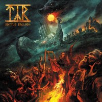
Wow...wonderful coverart!
about the music - i wont be listening to just samples...i would wait
----
My rest seems now calm and deep
Finally I got my dead man sleep
Loading...
|
ImNotMetal
Posts: 62  |
On the way... 
Loading...
|
Bad English
Tage Westerlund
Posts: 61015  |
So far I ahve felings in this album tahy try craite something like old days but same time something from each album, not bad, last was worsth ever, but I wate till album be out for judge
----
I stand whit Ukraine and Israel. They have right to defend own citizens.
Stormtroopers of Death - ''Speak English or Die''
 apos;'
[image]
I better die, because I never will learn speek english, so I choose dieing
Loading...
|
Marcel Hubregtse
Grumpy Old Fuck
ElitePosts: 40071  |
Why another horrendous photshop cover art? Jeez, this is getting lame and boring.
----
Member of the true crusade against European Flower Metal
Yesterday is dead and gone, tomorrow is out of sight
Dawn Crosby (r.i.p.)
05.04.1963 - 15.12.1996

Loading...
|
Hrothdane
Posts: 489  |
Written by Marcel Hubregtse on 25.06.2010 at 20:53
Why another horrendous photshop cover art? Jeez, this is getting lame and boring.
What is wrong with photoshop? Or does it have too much color for Mr. Gloom and Doom?
----
Despair is death, and I'm not interested in dying.
Member of the True Crusade against True Crusades
Loading...
|
thesabbathfan
Posts: 410  |
Those are so sick!!!
----
Loading...
|
Marcel Hubregtse
Grumpy Old Fuck
ElitePosts: 40071 |
Written by Hrothdane on 25.06.2010 at 21:11
Written by Marcel Hubregtse on 25.06.2010 at 20:53
Why another horrendous photshop cover art? Jeez, this is getting lame and boring.
What is wrong with photoshop? Or does it have too much color for Mr. Gloom and Doom?
This album cover is way too dark. My problem with photoshop is that it kills most real artists.
This cover is generic, no thught was put into it. way too dark for the music Blind Guardian plays. etc. etc.
Btw, the samples sound quite nice, though.
----
Member of the true crusade against European Flower Metal
Yesterday is dead and gone, tomorrow is out of sight
Dawn Crosby (r.i.p.)
05.04.1963 - 15.12.1996
Loading...
|
Hrothdane
Posts: 489 |
Written by Marcel Hubregtse on 25.06.2010 at 22:13
Written by Hrothdane on 25.06.2010 at 21:11
Written by Marcel Hubregtse on 25.06.2010 at 20:53
Why another horrendous photshop cover art? Jeez, this is getting lame and boring.
What is wrong with photoshop? Or does it have too much color for Mr. Gloom and Doom?
This album cover is way too dark. My problem with photoshop is that it kills most real artists.
This cover is generic, no thought was put into it. way too dark for the music Blind Guardian plays. etc. etc.
Btw, the samples sound quite nice, though.
Digital artists are just as much "real" artists as any other. The cover isn't going to win most original album cover of the year, but I disagree that no thought was put into it. The composition of the cover is simple, but they are arranged in a way that keeps your eyes moving around the picture, and the pyramid serves as a kind of arrow pointing to the band name. The colors were chosen and placed well; the blue makes the orange in the center pop more. I might think the cover was too dark normally, but it gives an edge to the bright colors.
I agree about the samples. It sounds like they brought back more of the intensity of their earlier albums.
----
Despair is death, and I'm not interested in dying.
Member of the True Crusade against True Crusades
Loading...
|
WorpeX
Made of Metal
Posts: 1347  |
WorpeXMade of MetalPosts: 1347
WOW. These samples sound absolutely incredible. Im really excited to hear Ride into Obsession and a Voice in the Dark especially!
Loading...
|
Symmachus
Posts: 2002
|
The album artwork nails it! I find it totally awesome and in good taste. I would love to hear the songs on that album.
Loading...
|
Lord_Regnier
Posts: 1469  |
Written by Marcel Hubregtse on 25.06.2010 at 22:13
Btw, the samples sound quite nice, though.
This comment, coming from you, takes me by surprise.
To be honest, it's only samples, but I find them boring. Perhaps a bit better than Blind Guardian's recent material but still rather dull.
----
"Why would we fear death, when life is so much more frightening?"
Loading...
|
Abattoir
StaffPosts: 3630  |
Samples sound very promising...I guess the whole stuff is going to be a blast.
About album artwork....it's nothing special, however I don't realy care.
Loading...
|