Original post
Posted by
corrupt, 13.11.2008 - 03:01
This is not really art, but Art-forums seem closest related to this.
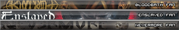
I've been doing a few old-school web 2.0 userbars during my last exams period to kill some time when I was bored from learning. I never really meant for this to go anywhere but I had a lot of fun with it. And since I just discovered that I'd reached
exactly 100 posts here on MS, I thought I might as well share them with you in my first thread here.
I've done most of the work in GIMP (since I'm a Linux guy) and used Photoshop for a few details and things I was too lazy to do in GIMP. The first one was the Nevermore bar in my sig, where I started trying to leave the classic slightly polished web 2.0 look behind to go for a look as if the bar was made of thick glass and had a real depth. I really liked the outcome so I did a few more, using mostly bands I was listening to at that time and in most cases my most favourite album by every particular band. If that cover didn't provide good results, I went looking for an album cover of that band that was more suited for this. As with Trail Of Tears.
Maybe one or two of you have use for these. I'm also open to criticism. But probably not to change what I've already posted here (except a few like Edguy, Hammerfall of Trail Of Tears that I'm not really pleased with), but to keep in mind for future work.
Update Aug. 19 2009
I proudly present: The signature 3-image generator script.
If you want more than one userbar but metalstorm only allows one image in your signature, go
here and use the fancy little script I spit together to generate one image containing three userbars. (I will adapt it to also allow for only 2 soon).
Feedback highly appreciated. Especially if you find a combination of userbars that metalstorm won't accept because of it's filesize.
Enjoy.
Update Aug. 28 2009
The script now allows for 2-userbar images by selecting "-none-" as third choice.
Update Dec. 12 2008
How to use:
Since people keep asking me how to put these images into their signatures, here's a little howto:
First download the image to your harddrive (screenshot taken using Firefox):
Then klick on 'Edit profile' in the top left corner of the Metalstorm page.
Where it says 'Signature image upload', put the url to your downloaded image into the textbox.
Then put the [image] tag somewhere into your signature. It will be replaced by the image as soon as your profile is shown to anyone.
Finally click 'submit' and check your signature in the Forum.
Bands:
Styles:
Requests:
Request [user_id]1763[/user_id]:
Request [user_id]22728[/user_id]:
Request [user_id]23361[/user_id]:
Request [user_id]36527[/user_id]:
Request [user_id]35649[/user_id]:
Request [user_id]12648[/user_id]:
Request [user_id]33116[/user_id]:
Request [user_id]6759[/user_id]:
Request [user_id]8309[/user_id]:
Request [user_id]36309[/user_id]:
Request [user_id]31185[/user_id]:
Request [user_id]23926[/user_id]:
Request [user_id]32187[/user_id]:
Request [user_id]8943[/user_id]:
Request [user_id]99525[/user_id]:
Request [user_id]21268[/user_id]:
Request [user_id]41261[/user_id]:
Request [user_id]37247[/user_id]
Request [user_id]24750[/user_id]
Request [user_id]99525[/user_id]
Request [user_id]102171[/user_id]
Request [user_id]105297[/user_id]
Request [user_id]36894[/user_id]
Request [user_id]28368[/user_id]
Request [user_id]18167[/user_id]
Suggestions:
Suggestion [user_id]207[/user_id]:
Misc/Fun:
Rework of a metalstorm bar I've seen on these forums:
Dedication to the MS Awards '08:
And while I was at it, one to the Awards '07:
Posts: 4331  |
Posts: 4331
Done a few more and also raped the MS Awards 08 banner for one. Mainly because I liked the overall look of it and as long as we do have awards that are actually about the music we should do everything to keep that going!
----
Loading...
|
Posts: 353  |
Posts: 353
Very nice design...
Loading...
|
Posts: 330  |
Posts: 330
Yeah, good work indeed!
Can you make an Ayreon one, if you're not busy? And maybe Sonata Arctica? 
----
Opinions are like assholes, everybody has one, and they all stink.
Loading...
|
Posts: 204  |
Posts: 204
Very zazzy! Is there any chance you could make an Arcturus one, please?
Loading...
|
Posts: 4331 |
Posts: 4331
Written by Zmaj Ognjeni Vuk on 07.02.2009 at 17:30
Can you make an Ayreon one, if you're not busy? And maybe Sonata Arctica?
Anything to keep me from studying 
There you go:
With Ayreon I started the 01011001 version first but wasn't very satisfied with the outcome. That's why I gave it another try using The Human Equation as a motive (the album's better anyway ) The Human Equation version turned out to look fine, so I reworked 01011001 a bit and there you have em both.
Sonata are difficult because their album covers usually blow. And Unia is out of the question because .. well, you know. So the one that worked is this one using the Reckoning Night motive.
Any criticism my way please.
----
Loading...
|
Posts: 4919  |
Posts: 4919
Written by corrupt on 08.02.2009 at 18:20
Written by Zmaj Ognjeni Vuk on 07.02.2009 at 17:30
Can you make an Ayreon one, if you're not busy? And maybe Sonata Arctica?
Anything to keep me from studying
Aye, totally agree. 
About your userbars.. they're great, really. Looks interesting. Some time ago I worked with these ones too, but didn't like the result, so I quit it.
My advice - don't cut off 20% of bands' logos, because it looks like you haven't got the place where to put them... but you always can resize them, so what's the problem?
Loading...
|
Posts: 4331 |
Posts: 4331
Written by Ascendant187 on 08.02.2009 at 16:39
Very zazzy! Is there any chance you could make an Arcturus one, please?
La Masquerade Infernale is a nice album cover. That's why this went so quickly. Almost no work involved and it looks pretty good.
Same here, tell if and why you like it or not please.
----
Loading...
|
Posts: 330 |
Posts: 330
Written by corrupt on 08.02.2009 at 18:20
Anything to keep me from studying
There you go:
With Ayreon I started the 01011001 version first but wasn't very satisfied with the outcome. That's why I gave it another try using The Human Equation as a motive (the album's better anyway ) The Human Equation version turned out to look fine, so I reworked 01011001 a bit and there you have em both.
Sonata are difficult because their album covers usually blow. And Unia is out of the question because .. well, you know. So the one that worked is this one using the Reckoning Night motive.
Any criticism my way please.
They are quite nice, thank you.
Although, I like the 01011001 one better than the THE one, because Ayreon logo stands out better (=easier to see).
As for Sonata - it's the best Sonata userbar I've seen so far.  (also, strangely enough, I don't have anything against Unia, I even like more songs than not)
----
Opinions are like assholes, everybody has one, and they all stink.
Loading...
|
Posts: 4331 |
Posts: 4331
Written by Ragana on 08.02.2009 at 18:39
Written by corrupt on 08.02.2009 at 18:20
Written by Zmaj Ognjeni Vuk on 07.02.2009 at 17:30
Can you make an Ayreon one, if you're not busy? And maybe Sonata Arctica?
Anything to keep me from studying
Aye, totally agree.
About your userbars.. they're great, really. Looks interesting. Some time ago I worked with these ones too, but didn't like the result, so I quit it.
My advice - don't cut off 20% of bands' logos, because it looks like you haven't got the place where to put them... but you always can resize them, so what's the problem?
I've actually been experimenting with different ways to present band logos. But of all my tries, cutting parts away yielded by far the most pleasing results. I really tried to create an illusion of depth and if you look at those bars closely you'll notice I've used shadows wherever possible to emphasize this depth. It's like looking through a window at a wider scene. At least that's what I'm trying to do.
Now if I centered the logos within the boundaries of the bars, it would resemble looking at a picture on a canvas rather than create visual depth. Compare the Trail Of Tears bar with any other. It's the bar I dislike the most. But by the time I was making it, the band name was just too wide to cut anything of and leave space on the bar for anything else. So I'm hoping on their next album to maybe feature a decent band logo
----
Loading...
|
Posts: 4919 |
Posts: 4919
Yeah, I know how to make this shadow effect, but I'm talking just about those logos. I understand that it's hard to put the logo all in one userbar, even more - it may look not as good as you thought before, but at least it's readable. I mean, look at those two Children Of Bodom userbars - upper and bottom edges of both logos are cut off, and it just looks weird. Furthermore, userbar with the logo of High On Fire has an ultimate cut-off. If I haven't read the tittle on the right side of the userbar, I wouldn't be able to understand what it means, because you have cut off about half of that logo.
Well... personally I am cool with the userbar of Trail Of Tears.
Loading...
|
Posts: 204 |
Posts: 204
Written by corrupt on 08.02.2009 at 18:40
Written by Ascendant187 on 08.02.2009 at 16:39
Very zazzy! Is there any chance you could make an Arcturus one, please?
La Masquerade Infernale is a nice album cover. That's why this went so quickly. Almost no work involved and it looks pretty good.
Same here, tell if and why you like it or not please.
That looks really cool. Cheers, man. It's definitely a great album and the cover art throughout is interesting to look at.
Loading...
|
Posts: 5102  |
Posts: 5102
Could I request one with Wuthering Heights?
----
Dreams are made so we don't get bored when we sleep
Loading...
|
Posts: 4331 |
Posts: 4331
Written by GT on 17.02.2009 at 21:55
Could I request one with Wuthering Heights?
Course you can. Only I'm heavily studying right now and living at my girlfriend's. So it might be a few days/weeks until I'm back home with my Computer
----
Loading...
|
Posts: 5102 |
Posts: 5102
Written by corrupt on 17.02.2009 at 22:31
Written by GT on 17.02.2009 at 21:55
Could I request one with Wuthering Heights?
Course you can. Only I'm heavily studying right now and living at my girlfriend's. So it might be a few days/weeks until I'm back home with my Computer
That's quite alright. I'm in no hurry.
----
Dreams are made so we don't get bored when we sleep
Loading...
|
Posts: 4331 |
Posts: 4331
Written by GT on 18.02.2009 at 10:43
Written by corrupt on 17.02.2009 at 22:31
Written by GT on 17.02.2009 at 21:55
Could I request one with Wuthering Heights?
Course you can. Only I'm heavily studying right now and living at my girlfriend's. So it might be a few days/weeks until I'm back home with my Computer
That's quite alright. I'm in no hurry.
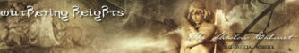
OK. look at this.
I don't consider it done yet. The gradientborder around the logo is still pixelated here and there but I really like this look. Any wishes as to what the text should say?
----
Loading...
|
Posts: 4920 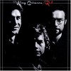 |
Posts: 4920
Dude the Arcturus one is awesome! Any Moonsorrow?
----
IntoPlighT said: "Slipknot is 15 years old how the fuck is that Nu metal?"
BEST. QUOTE. EVER.
Loading...
|
Posts: 5102 |
Posts: 5102
Written by corrupt on 19.02.2009 at 16:10
Written by GT on 18.02.2009 at 10:43
Written by corrupt on 17.02.2009 at 22:31
Written by GT on 17.02.2009 at 21:55
Could I request one with Wuthering Heights?
Course you can. Only I'm heavily studying right now and living at my girlfriend's. So it might be a few days/weeks until I'm back home with my Computer
That's quite alright. I'm in no hurry.
OK. look at this.
I don't consider it done yet. The gradientborder around the logo is still pixelated here and there but I really like this look. Any wishes as to what the text should say?
It looks really good. I especially like that you got the ravens in there since they're kinda important to the band. As for the text I suggest either Wuthering Heights Fan or WH Fan
----
Dreams are made so we don't get bored when we sleep
Loading...
|
Posts: 4331 |
Posts: 4331
Written by Elio on 19.02.2009 at 17:22
Dude the Arcturus one is awesome! Any Moonsorrow?
Thanks. How 'bout this?
It's another one of those covers that work perfectly without having to photoshop the logo onto it. Looks darkly elegant
Written by GT on 20.02.2009 at 12:49
It looks really good. I especially like that you got the ravens in there since they're kinda important to the band. As for the text I suggest either Wuthering Heights Fan or WH Fan
OK, cool. I didn't know that. After looking at it for a day I got used to this look. Maybe I find a way to get it less pixelated.
Here's one with "wuthering heights fan".
I somehow fucked up the first post, making it unreadable. I don't know what exactly I did wrong there but I PM'ed Ivan about it. I hope he has access to the database and can fix my post. The Page doesn't let me edit it anymore. Just changes table widths when I click on 'edit'. If not, I may need to respawn the thread 
----
Loading...
|
Posts: 4920 |
Posts: 4920
Yeah, really nice
----
IntoPlighT said: "Slipknot is 15 years old how the fuck is that Nu metal?"
BEST. QUOTE. EVER.
Loading...
|
Posts: 5102 |
Posts: 5102
Written by corrupt on 20.02.2009 at 21:16
Here's one with "wuthering heights fan".
I somehow fucked up the first post, making it unreadable. I don't know what exactly I did wrong there but I PM'ed Ivan about it. I hope he has access to the database and can fix my post. The Page doesn't let me edit it anymore. Just changes table widths when I click on 'edit'. If not, I may need to respawn the thread
Thank you. Yeah the thread seems to be kinda weird
----
Dreams are made so we don't get bored when we sleep
Loading...
|
Posts: 4331 |
Posts: 4331
Written by GT on 21.02.2009 at 18:43
Thank you. Yeah the thread seems to be kinda weird
Unfortunately, although the whole staff seems to be online at times, Ivan isn't. Is there anyone else I could contact about this?
----
Loading...
|
Posts: 5102 |
Posts: 5102
Written by corrupt on 21.02.2009 at 18:58
Written by GT on 21.02.2009 at 18:43
Thank you. Yeah the thread seems to be kinda weird
Unfortunately, although the whole staff seems to be online at times, Ivan isn't. Is there anyone else I could contact about this?
I think Ivan is the only one who can solve this. I'll inform him as well
----
Dreams are made so we don't get bored when we sleep
Loading...
|
Posts: 4331 |
Posts: 4331
Written by GT on 21.02.2009 at 19:00
I think Ivan is the only one who can solve this. I'll inform him as well
Thx.
----
Loading...
|
Posts: 7263  |
Posts: 7263
How about a Funeral Mist userbar with a huge shot of the Jesus mangina from the newest album?
Loading...
|
Posts: 4331 |
Posts: 4331
Written by Dangerboner on 22.02.2009 at 05:03
How about a Funeral Mist userbar with a huge shot of the Jesus mangina from the newest album?
I tried. Believe me but that thing is so huge on that cover that it just either looks like crap or like nothing if you resize it to userbar height. So I went with his face. The album cover is very recognizeable and if you look closely, there's still the angel with the trumpet behind the text.
----
Loading...
|
Posts: 2574  |
Posts: 2574
Man, this is amazing. I can't believe I haven't seen this thread before. Good job. Keep up the good work! And maybe, if you have time, to make a Coroner userbar? That would be awesome!
----
Savor what you feel and what you see
Things that may not seem important now
But may be tomorrow
R.I.P. Chuck Schuldiner
Satan was a Backstreet Boy
Loading...
|
Posts: 375  |
Posts: 375
Here I have one
 :banger:
Loading...
|
Posts: 4920 |
Posts: 4920
Holy shit, corrupt, I just realised how many of these usebars you have created. You are bored, aren't you?  I had never seen the Death one, amazing with that eye there.
----
IntoPlighT said: "Slipknot is 15 years old how the fuck is that Nu metal?"
BEST. QUOTE. EVER.
Loading...
|
Posts: 4331 |
Posts: 4331
Written by K✞ulu on 04.03.2009 at 19:14
Man, this is amazing. I can't believe I haven't seen this thread before. Good job. Keep up the good work! And maybe, if you have time, to make a Coroner userbar? That would be awesome!
I tried man, but those guys have the most fucked-up 80s album cover art there is  I tried different approaches using each of those and this one can be considered the best one.
But I do think that Metallica bar suits your forum appearance very well
Written by Elio on 05.03.2009 at 21:14
Holy shit, corrupt, I just realised how many of these usebars you have created. You are bored, aren't you? I had never seen the Death one, amazing with that eye there.
As I said, I do it to keep my head from studying. And right now I'm in the middle of an exams period that so far just sucked. So don't take this away from me
No seriously, It's pretty enjoyable, plus I actually bought a student license of photoshop a couple of months ago and I don't find the time to put it to any more decent use than this. And seeing that you guys like the work is a motivator too, I gotta say that
----
Loading...
|
Posts: 2574 |
Posts: 2574
Written by corrupt on 06.03.2009 at 00:47
Written by K✞ulu on 04.03.2009 at 19:14
Man, this is amazing. I can't believe I haven't seen this thread before. Good job. Keep up the good work! And maybe, if you have time, to make a Coroner userbar? That would be awesome!
I tried man, but those guys have the most fucked-up 80s album cover art there is I tried different approaches using each of those and this one can be considered the best one.
But I do think that Metallica bar suits your forum appearance very well
I like it, but if you put the Coroner logo itself on top of it, that would be awesome indeed. Sorry for the pain in the ass. Thanks.
----
Savor what you feel and what you see
Things that may not seem important now
But may be tomorrow
R.I.P. Chuck Schuldiner
Satan was a Backstreet Boy
Loading...
|
