LeKiwi
High Fist Prog
Posts: 4099  |
LeKiwiHigh Fist ProgPosts: 4099 
Haven't heard Draconian in quite some time, but after hearing this I think I'll keep it that way.
Loading...
|
!J.O.O.E.!
Account deleted |
!J.O.O.E.!
Account deleted
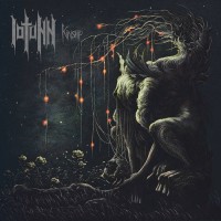
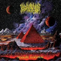
I predict 2016 will be the year in which every single metal album cover will be drawn by Chioreanu Constin. Getting a bit tired of them now tbh. He seems to be the new John Baizley.
Loading...
|
3rdWorld
China was a neat
Posts: 4367  |
^ Him and Paolo Girardi. I never grew tired of these guys' works. They are quite amazing, every single work by them.
Loading...
|
!J.O.O.E.!
Account deleted |
!J.O.O.E.!
Account deleted
Most of Paolo Girardi's is pretty dull imo =P
It's not that I dislike the art as such, more that it just shows a lack of imagination on the band's part. I don't want every disparate album to have the same style cover.
Loading...
|
3rdWorld
China was a neat
Posts: 4367  |
I feel it is because of his signature style more than anything. Also those are mostly death metal or obscure underground extreme metal bands and I don't think they will demand Mastodon or Tool level intellectual stuff from their cover artists. 
Loading...
|
The Melting Snow
Posts: 673  |
I liked the song a lot. been a long time since a nice ballad with melodic riffs and good lyrics.
Loading...
|
Carl Berg
Carl Berg
Posts: 589  |
Written by [user id=4365] on 16.10.2015 at 15:21
I predict 2016 will be the year in which every single metal album cover will be drawn by Chioreanu Constin. Getting a bit tired of them now tbh. He seems to be the new John Baizley.
Costin does amazing artwork. Quantity does not negate quality.
Loading...
|
!J.O.O.E.!
Account deleted |
!J.O.O.E.!
Account deleted
Written by Carl Berg on 17.10.2015 at 00:38
Costin does amazing artwork. Quantity does not negate quality.
The quality of the art isn't really in question, but rather how It negates individuality, which was my point. Sigh lost points for uniqueness with their new one, and even the new Grave has a Chioreanu as its cover, which seems ill-fitting to me. I think an album art should look like it belongs to the band, and when dozens of the them start using ones that have the same style something is lost in context. Like they just bought something off a shop shelf and used that to represent their music. Just feels lazy.
Loading...
|
Jeeers
Posts: 195  |
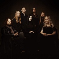
Oh, my ... what a bland and boring song! Did not expect this from the great Draconian.
Loading...
|
IronArkadius666
Posts: 107
|
Nice song, though i have come to realise how tired I am of the occasional muttered lines that Draconian do, tbh i don't like it when singers talk their lines instead of singing them but oh well.
New singer's great, she sounds like Sharon from Within Temptation.
Loading...
|
Alex F
Posts: 3519  |
Written by [user id=4365] on 16.10.2015 at 17:25
Most of Paolo Girardi's is pretty dull imo =P
It's not that I dislike the art as such, more that it just shows a lack of imagination on the band's part. I don't want every disparate album to have the same style cover.
It's much harder to distinguish individual pieces by Girardi than Constin. At least Chioreanu uses a much larger variety of color pairings, while Paolo pretty much sticks to the same pale browns and reds. I'd rather have these two make more art than have loads of bands ripping Beksinski pieces though haha. We all know the real king of modern metal art is Brian Smith
Loading...
|
!J.O.O.E.!
Account deleted |
!J.O.O.E.!
Account deleted
Written by Alex F on 17.10.2015 at 19:03
It's much harder to distinguish individual pieces by Girardi than Constin. At least Chioreanu uses a much larger variety of color pairings, while Paolo pretty much sticks to the same pale browns and reds. I'd rather have these two make more art than have loads of bands ripping Beksinski pieces though haha. We all know the real king of modern metal art is Brian Smith
Yeah I'm not sick of Brian Smith's work yet.
Actually I just realised I have a Chioreanu on wall, in the form of a postcard sized photo, and didn't realise it was him.

Loading...
|
Saidar
Posts: 20  |
Written by [user id=4365] on 17.10.2015 at 00:40
The quality of the art isn't really in question, but rather how It negates individuality, which was my point.
Draconian did this more evidently last time around, for A Rose For the Apocalypse. And regarding the quality of it - even by Anton's standards, that cover was ghastly.
Loading...
|
!J.O.O.E.!
Account deleted |
!J.O.O.E.!
Account deleted
Written by Saidar on 20.10.2015 at 19:34
Draconian did this more evidently last time around, for A Rose For the Apocalypse. And regarding the quality of it - even by Anton's standards, that cover was ghastly.
I had to remind myself of what it looked like... my God, what an eyesore.
Loading...
|


