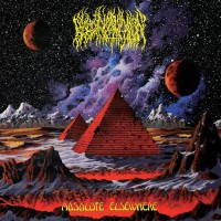
FeskarN
Posts: 872  |
I like many details in coverart but this looks messy.
----
The Land Is Silent... Before The Storm!
Loading...
|
Unhealer
Eclecticist
Posts: 2311  |
It's decent, would be better without all those unnecessary random white shapes and lines.
Loading...
|
Zap
Posts: 3580  |
Atrocious, just like the last one.
Loading...
|
LascaillesShroud
Posts: 164  |
And along comes the guy who likes it.
Loading...
|
Empyror
Posts: 89  |
I like it too. Better than the last one.
Loading...
|
CWA
Posts: 285  |
This cover art is awesome. It's not messy at all, most of you simply have the attention span of children and don't really take the time to look at the art. The art work is quite profound actually, but it requires some rudimentary knowledge of Eastern mysticism to understand it.
Loading...
|
Enissa
Posts: 816  |
It looks amazing actually, at least for me! 
Loading...
|
ScnD361
Posts: 73
|
I love it. It's a lot better than the last one... a lot better.
Loading...
|
PocketMetal
Posts: 750
|
Their best cover art by far , they usually don't have great covers though. it's detailed imo , not messy. it would actually look good on a physical copy.
Loading...
|
MELANCOHOLIC
Posts: 59  |
It is a good artwork but i still think The Divine Conspiracy is actually better. It is their second best imo
Loading...
|
Metalmenial
Posts: 15
|
It's interesting atwork. More mystical and more emotional and nicer than the last album atwork. I'm very demanding about cover art, of course, music also. So sometimes I must be a serious and critical, but I respect the terrible (don't like for me) cover art, because it's about feelings and opinions of bands. I agree with Unhealer. These white lines are unnecessary, but not forget, those lines maybe have importance for the creator. I think there is nothing to solve. It's a typical theme of a Epica with a typical cover art. One more information, Epica is affected by Mayan and contrariwise.
Loading...
|
Night Theater
Posts: 91  |
Written by Unhealer on 16.02.2014 at 14:17
It's decent, would be better without all those unnecessary random white shapes and lines.
Given that the album, at least in part, will be about quantum physics, I wouldn't say the white 'shapes' are random.
I, for one, love the cover art.
One of the reasons others love the Divine Conspiracy cover is because it has a naked Simone on the front... who doesn't like the cover?
I'll definitely want to review this album.
Loading...
|
R'Vannith
ghedengi
ElitePosts: 3099  |
Written by CWA on 16.02.2014 at 16:14
This cover art is awesome. It's not messy at all, most of you simply have the attention span of children and don't really take the time to look at the art. The art work is quite profound actually, but it requires some rudimentary knowledge of Eastern mysticism to understand it.
For a brief moment I'll muster all of my childish undivided attention just to say that I hope the Eastern mysticism of which you speak is indicative of the music in some way. It would be very interesting if this were the case.
Loading...
|
allgutsnoglory
Posts: 27
|
I hope it's better than Requiem. That was a boring album
Loading...
|
MHOE
Posts: 33
|
That cover art looks weird... Not a bad thing because I like to explore new things... But still, it's weird to me.
Those strange dull colours (or colour scheme), white lines/curves, hard-to-distinguish underwater elements (it's a bit messy)... Well, the previous album cover art also looked quite weird - and I enjoyed the album in the end.
Loading...
|
CWA
Posts: 285  |
Written by R'Vannith on 17.02.2014 at 06:59
Written by CWA on 16.02.2014 at 16:14
This cover art is awesome. It's not messy at all, most of you simply have the attention span of children and don't really take the time to look at the art. The art work is quite profound actually, but it requires some rudimentary knowledge of Eastern mysticism to understand it.
I hope the Eastern mysticism of which you speak is indicative of the music in some way.
Ditto
Loading...
|
Metalmenial
Posts: 15
|
It reminds me very Design Your Universe, which was fantastic. So I hope that the music will be fantastic and compact too.
I'm trying to understand what atwork means. This mountain is as peak of iceberg where is mysterious eye of something, divine maybe...Ship and submarine examine for something under water. The sky is also investigated.
Anyway, it's great imagination.
Tracklist:
1. Originem
2. The Second Stone
3. The Essence Of Silence
4. Victims Of Contingency
5. Sense Without Sanity - The Impervious Code
6. Unchain Utopia
7. The Fifth Guardian (interlude)
8. Chemical Insomnia
9. Reverence - Living In The Heart
10. Omen - The Ghoulish Malady
11. Canvas Of Life
12. Natural Corruption
13. The Quantum Enigma - Kingdom Of Heaven part II
Loading...
|
chronic-headache
Posts: 249  |
ITT: Art Snobs
i love this cover
Loading...
|
AngelofDeth
Cyborg Raptor
Posts: 1183  |
Written by Metalmenial on 17.02.2014 at 17:15
13. The Quantum Enigma - Kingdom Of Heaven part II
Stoked on the "Kingdom of Heaven Part II" part!
----
pewpew.. gotcha
Loading...
|
annodomini
Posts: 784  |
Written by Metalmenial on 17.02.2014 at 17:15
It reminds me very Design Your Universe, which was fantastic. So I hope that the music will be fantastic and compact too.
I'm trying to understand what atwork means. This mountain is as peak of iceberg where is mysterious eye of something, divine maybe...Ship and submarine examine for something under water. The sky is also investigated.
Anyway, it's great imagination.
Tracklist:
1. Originem
2. The Second Stone
3. The Essence Of Silence
4. Victims Of Contingency
5. Sense Without Sanity - The Impervious Code
6. Unchain Utopia
7. The Fifth Guardian (interlude)
8. Chemical Insomnia
9. Reverence - Living In The Heart
10. Omen - The Ghoulish Malady
11. Canvas Of Life
12. Natural Corruption
13. The Quantum Enigma - Kingdom Of Heaven part II
Well at least Requeiem had more original tracklist. It's amazing how they manage to keep the same structure over and over again. Still don't know if it's a great thing, though. Nevertheless, I enjoyed RFTI a lot, but still hope this to be more like DYU.
----
the riddle wants to be...
Loading...
|


