Metal Storm logo
Thrawsunblat - Reveal New Album Artwork And Tracklist


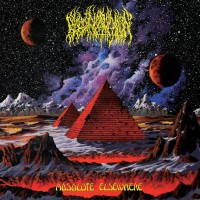
Canadian blackened folk metallers Thrawsunblat revealed today the cover art that will grace their new album Thrawsunblat III: Metachthonia. You can check it out below. They have locked themselves underground and have been working on the album non-stop. So now it's only a matter of time before the beast is unleashed and we might just get lucky if the band releases new music before the official album release. Are you excited for this new record?


Photo by Knate Myers and lettering by Adam Gillis


The tracklist has also been revealed, which will be as follows:

  • "Fires That Light The Earth"
  • "She Who Names The Stars"
  • "Dead Of Winter"
  • "Hypochthonic Remnants"
  • "Rivers Of Underthought"
  • "In Mist We Walk"

    Source: facebook.com
    Band profile: Thrawsunblat
  • Posted: 05.06.2015 by Gothmog_Motsham


    Comments

    ‹‹ Back to News
    Comments: 9   [ 1 ignored ]   Visited by: 82 users
    05.06.2015 - 20:28
    musclassia
    Staff
    The first album had a nice cover, this less so. Nice to see blue and orange remaining prominent on slightly naff metal album covers
    Loading...
    05.06.2015 - 21:06
    Feng
    Written by musclassia on 05.06.2015 at 20:28

    The first album had a nice cover, this less so. Nice to see blue and orange remaining prominent on slightly naff metal album covers

    I think this could've been nice if they toned down the colours and slight over production. The use of colour on the sky reminds me of Wintersun's 'Time I', which was in my opinion a horrible mess.
    Loading...
    05.06.2015 - 21:29
    Lionthrone
    I like it, but then this is one of my top 3 favorite bands and can do no wrong in my book.
    Loading...
    05.06.2015 - 21:30
    Eternity'sChild
    First full-length was quite good. I like the cover, but the color saturation seems a bit too high.
    Loading...
    05.06.2015 - 21:32
    musclassia
    Staff
    Written by Feng on 05.06.2015 at 21:06


    I think this could've been nice if they toned down the colours and slight over production. The use of colour on the sky reminds me of Wintersun's 'Time I', which was in my opinion a horrible mess.

    The idea's not necessarily bad, but the execution with the bright colors and contrast is way too close to the Ensiferum/Korpiklaani style, which is fine for them, but rather unsubtle and tacky compared to their previous cover. It just looks too fake and bright to carry the woodlands explorer vibe I feel it's trying to go for
    Loading...
    06.06.2015 - 06:43
    The Evergreen
    Written by Lionthrone on 05.06.2015 at 21:29

    I like it, but then this is one of my top 3 favorite bands and can do no wrong in my book.

    Also yes.
    I really like the cover. There's a lot of power there, much more interesting than their last. But in the end, it's a cover. I still think it's safe to say that music will be epic. I recently bought their Canada 2010 to go with Wanderer and it did not disappoint.
    Loading...
    06.06.2015 - 16:10
    UnknownCheese
    If I hadn't already heard this band I'd avoid them based on this cover and the new logo. Both are kinda fruity and give a polka metal vibe. Loved the debut album though.
    Loading...
    06.06.2015 - 18:42
    neonxaos
    I like the cover just fine, but this is one of my favorite bands of all time, so I'm far more interested in how it sounds.
    Loading...
    06.05.2016 - 00:10
    Rot Teufel
    I hope it'll have the same mariner's folkish flavour of the first album (and demo). That choise carry something new in the folk metal scene.
    ----
    Destroy all dreams, illusion damned in fire... A hellish need for power, it's my dark desire...
    Loading...

    Hits total: 2283 | This month: 16