mz
Posts: 4825  |
mzPosts: 4825 
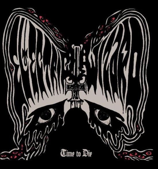
Yay I like the cover.
----
Giving my ears a rest from music.
Loading...
|
X-Ray Rod
Skandino
StaffPosts: 18374  |
Bring it on! 
----
Written by BloodTears on 19.08.2011 at 18:29
Like you could kiss my ass
Written by Milena on 20.06.2012 at 10:49
Rod, let me love you.
Loading...
|
!J.O.O.E.!
Account deleted |
!J.O.O.E.!
Account deleted
Pretty rubbish cover in all honestly. The concept is ok but it looks like it was drawn by a child. Still though, it's Electric Wizard so will likely be a great album.
Loading...
|
Lit.
Account deleted |
Lit.
Account deleted
Written by [user id=4365] on 01.07.2014 at 19:39
it looks like it was drawn by a child.
What, do you live in Japan or something?
Loading...
|
!J.O.O.E.!
Account deleted |
!J.O.O.E.!
Account deleted
Written by [user id=101272] on 01.07.2014 at 19:59
What, do you live in Japan or something?
Racist.
Loading...
|
Lit.
Account deleted |
Lit.
Account deleted
Written by [user id=4365] on 01.07.2014 at 20:01
Racist.
Read "What, do you live in a place where the children are so good at drawing this pretty well-drawn cover actually looks like it was drawn by a child to you?"
Yeah, I probably could've worded that better.
Loading...
|
!J.O.O.E.!
Account deleted |
!J.O.O.E.!
Account deleted
Written by [user id=101272] on 01.07.2014 at 20:11
Read "What, do you live in a place where the children are so good at drawing this pretty well-drawn cover actually looks like it was drawn by a child to you?"
Yeah, I probably could've worded that better.
It's not that it really looks like it was drawn by a child, it's more that it's horribly rendered; those iffy jagged edges make it look like a bad print out. It's also a bit bland and forgettable.
Loading...
|
mz
Posts: 4825  |
mzPosts: 4825 
If anything, I prefer this one over the dopethrone. That's one shitty album cover, and shame that it's inserted on such a great record.
----
Giving my ears a rest from music.
Loading...
|
Ocean Sage
Posts: 474  |
Written by mz on 01.07.2014 at 20:19
If anything, I prefer this one over the dopethrone. That's one shitty album cover, and shame that it's inserted on such a great record.
THE FUCK?! Dopethrone's album art is amazing! It's so cool. Time to Die's looks alright, but it looks very similar to Black Masses.
This album is shaping up nicely thus far. I can't wait.
Loading...
|
!J.O.O.E.!
Account deleted |
!J.O.O.E.!
Account deleted
Written by mz on 01.07.2014 at 20:19
If anything, I prefer this one over the dopethrone. That's one shitty album cover, and shame that it's inserted on such a great record.
While I don't agree it's amazing, it is iconic, and definitely better than this one. Come My Fanatic and Supercoven are EW's best artworks.
Loading...
|
X-Ray Rod
Skandino
StaffPosts: 18374  |
"We Live" is friggin dope as well...
----
Written by BloodTears on 19.08.2011 at 18:29
Like you could kiss my ass
Written by Milena on 20.06.2012 at 10:49
Rod, let me love you.
Loading...
|
Scathach666
Posts: 60
|
Loading...
|
Troy Killjoy
perfunctionist
StaffPosts: 21306  |
I wouldn't mind it as much if they blew it up with a ton of neon colors like the latest Mastodon album. And if I took a hit of acid beforehand.
But neither of those things are happening so I'll take sides with those who think it looks pretty amateurish.
----
"Wise men talk because they have something to say; fools because they have to say something."
Loading...
|
Ocean Sage
Posts: 474  |
Written by [user id=4365] on 01.07.2014 at 20:44
Written by mz on 01.07.2014 at 20:19
If anything, I prefer this one over the dopethrone. That's one shitty album cover, and shame that it's inserted on such a great record.
While I don't agree it's amazing, it is iconic, and definitely better than this one. Come My Fanatic and Supercoven are EW's best artworks.
You know, I actually agree with you on this new cover, the edges are fuzzy like a 1st year graphic design student who just learned how to photoshop or something.
Honestly I think the Electric Wizard self-titled album by far for me has the nicest looking artwork of their discography, but I've always had a thing for the Come My Fanatics...'s cover. Everyone I know loves the Dopethrone cover regardless of if they're fans of EW or not.
Loading...
|
Ocean Sage
Posts: 474  |
Written by Troy Killjoy on 01.07.2014 at 20:59
I wouldn't mind it as much if they blew it up with a ton of neon colors like the latest Mastodon album. And if I took a hit of acid beforehand.
But neither of those things are happening so I'll take sides with those who think it looks pretty amateurish.
Electric WIzard is a bit dark to have such a bright cover though, wouldn't you agree? Maybe something close to Electric Wizard's self-titled cover artwork would be cool again though. That had color and real art that stands out. It's practically a mural or something.
Loading...
|
!J.O.O.E.!
Account deleted |
!J.O.O.E.!
Account deleted
Written by Ocean Sage on 01.07.2014 at 21:11
You know, I actually agree with you on this new cover, the edges are fuzzy like a 1st year graphic design student who just learned how to photoshop or something.
Honestly I think the Electric Wizard self-titled album by far for me has the nicest looking artwork of their discography, but I've always had a thing for the Come My Fanatics...'s cover. Everyone I know loves the Dopethrone cover regardless of if they're fans of EW or not.
I agree that the s/t album art is great, but my issue is that it looks like it belongs in Cathedral's discography. Just feels a bit out of place amongst the rest of the EW albums. That being said, as a piece of art it's great.
I'm wondering if the final art of this one will look a bit sharper.
Loading...
|
Ilham
Giant robot
Posts: 5161  |
IlhamGiant robotPosts: 5161 
I just wish they all stopped using very ugly fraktur fonts. I like frakturs but there are better ones. And why oh why did the guy use a condensed one on top of that? And also there are other ways of applying text rather than just finding an empty space and go "ooooh I'll put it there without thinking about the way it blends with the rest or having some kind balance between void and text". Why have a great typographic work and idea on "Electric Wizard" and then just put "Time to Die" down there like that?
I hope there is just a definition problem with this pic and that those edges will be smoother later.
Loading...
|
Auntie Sahar
Drone Empress
Posts: 5989  |
I'm with Troy on this one, I like the design a lot, but it could've used some more color, black and white with those little traces of red for the eyes is a bit dull.
----
I am the Magician and the Exorcist. I am the axle of the wheel, and the cube in the circle. “Come unto me” is a foolish word: for it is I that go.
~ II. VII
Loading...
|
Ocean Sage
Posts: 474  |
Written by [user id=4365] on 01.07.2014 at 21:15
Written by Ocean Sage on 01.07.2014 at 21:11
You know, I actually agree with you on this new cover, the edges are fuzzy like a 1st year graphic design student who just learned how to photoshop or something.
Honestly I think the Electric Wizard self-titled album by far for me has the nicest looking artwork of their discography, but I've always had a thing for the Come My Fanatics...'s cover. Everyone I know loves the Dopethrone cover regardless of if they're fans of EW or not.
I agree that the s/t album art is great, but my issue is that it looks like it belongs in Cathedral's discography. Just feels a bit out of place amongst the rest of the EW albums. That being said, as a piece of art it's great.
I'm wondering if the final art of this one will look a bit sharper.
lol it does look like a Cathedral cover! I never noticed.
I am pretty sure the final image will look much better on the album in person. I'm not too worried. I liked BM enough.
Loading...
|
Auntie Sahar
Drone Empress
Posts: 5989  |
Written by [user id=4365] on 01.07.2014 at 21:15
Just feels a bit out of place amongst the rest of the EW albums.
This sentence made me  for some reason, maybe it was that abbreviation
----
I am the Magician and the Exorcist. I am the axle of the wheel, and the cube in the circle. “Come unto me” is a foolish word: for it is I that go.
~ II. VII
Loading...
|
!J.O.O.E.!
Account deleted |
!J.O.O.E.!
Account deleted
Written by Auntie Sahar on 02.07.2014 at 01:15
This sentence made me  for some reason, maybe it was that abbreviation for some reason, maybe it was that abbreviation
It could look very camp; like an exaggerated "Ewwww!" sorta thing.
Loading...
|
Dangerboner
Lactation Cnslt
Posts: 7262  |
Loading...
|
Spirit Molecule
spirit molecule
Posts: 1918  |
Haha, the cover is quite shit.
Santos, of Santos Illustration, asked the EW fans to get the band to get in touch with him or at least suggest better artists to EW so that they could get artwork that reflects how good the music is 
Loading...
|
Ocean Sage
Posts: 474  |
Loading...
|





 for some reason, maybe it was that abbreviation
 He is basically Cathedral's visualisation and did all of their work except for Endtyme I think?...
  Not to mention that the s/t has got the same font as Black Sabbath's s/t.
