MechanisT
Account deleted |
MechanisT
Account deleted
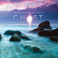
The cover is lame, but I'm sure the music will have a minimum base-quality that Devin won't ever lose, so looking forward to the album...
Loading...
|
Introspekrieg
Totemic Lust
ElitePosts: 2749  |
Written by [user id=109200] on 28.02.2011 at 00:21
The cover is lame, but I'm sure the music will have a minimum base-quality that Devin won't ever lose, so looking forward to the album...
What's wrong with the cover? Too simple?
Loading...
|
MechanisT
Account deleted |
MechanisT
Account deleted
Written by Introspekrieg on 28.02.2011 at 05:04
Written by [user id=109200] on 28.02.2011 at 00:21
The cover is lame, but I'm sure the music will have a minimum base-quality that Devin won't ever lose, so looking forward to the album...
What's wrong with the cover? Too simple?
In my opinion the album title and the cover don't go exactly hand-in-hand, you know what I mean?
Loading...
|
Introspekrieg
Totemic Lust
ElitePosts: 2749  |
Written by [user id=109200] on 28.02.2011 at 12:21
Written by Introspekrieg on 28.02.2011 at 05:04
Written by [user id=109200] on 28.02.2011 at 00:21
The cover is lame, but I'm sure the music will have a minimum base-quality that Devin won't ever lose, so looking forward to the album...
What's wrong with the cover? Too simple?
In my opinion the album title and the cover don't go exactly hand-in-hand, you know what I mean?
After hearing " Drench" (an outtake from Ghost) the cover seems appropriate... we'll see.
Loading...
|
MechanisT
Account deleted |
MechanisT
Account deleted
Written by Introspekrieg on 28.02.2011 at 14:39
Written by [user id=109200] on 28.02.2011 at 12:21
Written by Introspekrieg on 28.02.2011 at 05:04
Written by [user id=109200] on 28.02.2011 at 00:21
The cover is lame, but I'm sure the music will have a minimum base-quality that Devin won't ever lose, so looking forward to the album...
What's wrong with the cover? Too simple?
In my opinion the album title and the cover don't go exactly hand-in-hand, you know what I mean?
After hearing "Drench" (an outtake from Ghost) the cover seems appropriate... we'll see.
Lol...then the title is lame. 
Loading...
|
tmclane
Posts: 8
|
30.03.2011 - 04:06Rating: 8
Im thinking the cover looks sick...
Loading...
|
MechanisT
Account deleted |
MechanisT
Account deleted
Well what do you know? The cover's changed, and for the better! Devin must be taking my criticisms to heart...
Loading...
|
Risto
Wandering Midget
Posts: 1115  |
RistoWandering MidgetPosts: 1115 
Written by [user id=109200] on 05.04.2011 at 16:41
Well what do you know? The cover's changed, and for the better! Devin must be taking my criticisms to heart...
The green leaf thing is the slipcase. Addicted and Ki have similar artwork thematics.
Loading...
|
MechanisT
Account deleted |
MechanisT
Account deleted
Written by Risto on 05.04.2011 at 17:26
Written by [user id=109200] on 05.04.2011 at 16:41
Well what do you know? The cover's changed, and for the better! Devin must be taking my criticisms to heart...
The green leaf thing is the slipcase.
Thanks for the insight! Good thing it's a slipcase, it didn't look well as a cover...
Loading...
|
metalicharly
Posts: 23
|
I didn´t expect this album to be like this. It's half new age and half ambient/chill out. Flutes, electronics, no guitars, no drums..softest melodies ever.
Loading...
|
Wyrd
Posts: 292  |
Written by [user id=109200] on 05.04.2011 at 17:27
Written by Risto on 05.04.2011 at 17:26
Written by [user id=109200] on 05.04.2011 at 16:41
Well what do you know? The cover's changed, and for the better! Devin must be taking my criticisms to heart...
The green leaf thing is the slipcase.
Thanks for the insight! Good thing it's a slipcase, it didn't look well as a cover...
Because it's all about the artwork, right? thats what makes a good album
----
"The bands called Demon Hunter! They hunt demons!"
Loading...
|
MechanisT
Account deleted |
MechanisT
Account deleted
Written by Wyrd on 26.05.2011 at 02:11
Written by [user id=109200] on 05.04.2011 at 17:27
Written by Risto on 05.04.2011 at 17:26
Written by [user id=109200] on 05.04.2011 at 16:41
Well what do you know? The cover's changed, and for the better! Devin must be taking my criticisms to heart...
The green leaf thing is the slipcase.
Thanks for the insight! Good thing it's a slipcase, it didn't look well as a cover...
Because it's all about the artwork, right? thats what makes a good album
No, it doesn't, but it sure as hell leaves a positive/negative impression, if you know what I mean.
Loading...
|
Wyrd
Posts: 292  |
Written by [user id=109200] on 26.05.2011 at 02:12
Written by Wyrd on 26.05.2011 at 02:11
Written by [user id=109200] on 05.04.2011 at 17:27
Written by Risto on 05.04.2011 at 17:26
Written by [user id=109200] on 05.04.2011 at 16:41
Well what do you know? The cover's changed, and for the better! Devin must be taking my criticisms to heart...
The green leaf thing is the slipcase.
Thanks for the insight! Good thing it's a slipcase, it didn't look well as a cover...
Because it's all about the artwork, right? thats what makes a good album
No, it doesn't, but it sure as hell leaves a positive/negative impression, if you know what I mean.
I do, but I also well enough never to 'Judge a book by it's cover.'
----
"The bands called Demon Hunter! They hunt demons!"
Loading...
|
MechanisT
Account deleted |
MechanisT
Account deleted
Written by Wyrd on 26.05.2011 at 02:15
Written by [user id=109200] on 26.05.2011 at 02:12
Written by Wyrd on 26.05.2011 at 02:11
Written by [user id=109200] on 05.04.2011 at 17:27
Written by Risto on 05.04.2011 at 17:26
Written by [user id=109200] on 05.04.2011 at 16:41
Well what do you know? The cover's changed, and for the better! Devin must be taking my criticisms to heart...
The green leaf thing is the slipcase.
Thanks for the insight! Good thing it's a slipcase, it didn't look well as a cover...
Because it's all about the artwork, right? thats what makes a good album
No, it doesn't, but it sure as hell leaves a positive/negative impression, if you know what I mean.
I do, but I also well enough never to 'Judge a book by it's cover.'
Just to clear the air here; not once have I uttered a single word against the music/album. You can check if you want. I don't know how you came to the conclusion that I'm bashing Devin's latest offerings because of some stupid artwork. I agree with the saying that you've highlighted, but the context in this instance is well and truly off the mark.
Loading...
|
Wyrd
Posts: 292  |
I was only observing the fact that you seemed so focused on the art work rather then the music.
----
"The bands called Demon Hunter! They hunt demons!"
Loading...
|
MechanisT
Account deleted |
MechanisT
Account deleted
How am I supposed to comment on the music when it hasn't even been released yet? I'm aware of teasers/leaked versions, but I'll pass that option. I would like to hear it when it gets released officially.
Loading...
|
R'Vannith
ghedengi
ElitePosts: 3099  |
27.05.2011 - 03:38Rating: 7
The artwork is an important part of the album for me, if it has good artwork I tend to be more interested in wanting to listen to the music. Then again there is wonderful music out there hidden behind mediocre cover art.
Loading...
|
|
Album Release day (June 20, 2011)
|
Album Release day (June 20, 2011)
|
SceneryOfLoss
Posts: 195  |
22.06.2011 - 18:49Rating: 3
I didn't enjoyed it a lot...
Loading...
|
Fat & Sassy!
ElitePosts: 3857  |
22.06.2011 - 22:40Rating: 9
And here I was thinking I was gonna like Deconstruction more than this. What an incredibly beautiful and moving piece of work. It just feels so... natural and honest. <3 Complete opposite of Deconstruction, obviously.
Loading...
|
RealGone
Posts: 8
|
Loading...
|
@gent_-_orange
Posts: 905  |
Written by Fat & Sassy! on 22.06.2011 at 22:40
And here I was thinking I was gonna like Deconstruction more than this. What an incredibly beautiful and moving piece of work. It just feels so... natural and honest.
100% agree with this... Its good to see him doing music that HE wants to make and not what people expect... Natural and Honest are exactly what id use to describe this record.
Loading...
|
Baz Anderson
StaffPosts: 13255  |
I actually enjoyed this more than I expected to, too.
Loading...
|
*!*
Posts: 52  |
13.07.2011 - 00:11Rating: 6
A relaxing album this is, with few nice melodies here and there but the long songs get a lil boring. i give it a 6.5.
Loading...
|
Opethian
Posts: 1764  |
19.07.2011 - 20:27Rating: 7
Written by [user id=109200] on 28.02.2011 at 00:21
The cover is lame, but I'm sure the music will have a minimum base-quality that Devin won't ever lose, so looking forward to the album...
lol the album art totally depicts whats inside that album itself, Peaceful, Melodic, Ambient and Atmospheric  . Im sorry that its not a simple cover like most album art works nowadays 
Loading...
|
MechanisT
Account deleted |
MechanisT
Account deleted
Written by Opethian on 19.07.2011 at 20:27
Written by [user id=109200] on 28.02.2011 at 00:21
The cover is lame, but I'm sure the music will have a minimum base-quality that Devin won't ever lose, so looking forward to the album...
lol the album art totally depicts whats inside that album itself, Peaceful, Melodic, Ambient and Atmospheric  . Im sorry that its not a simple cover like most album art works nowadays . Im sorry that its not a simple cover like most album art works nowadays 
My comment was actually about a previous "cover" and not this one. Look at the date of my post. 
And yes, this cover's hella better.
Loading...
|
Mehdi Taba
Mehdi Taba
Posts: 437  |
03.10.2011 - 00:36Rating: 9
I think this is pure and emotional work, I can feel the songs especially woodwinds parts, Really good work .
----
Stop seeing things and people in a binary way. Everything has its own spectrum and complexity. Be patient and learn about the world.
Loading...
|
Crème fraiche
Posts: 705  |
06.12.2011 - 00:52Rating: 9
I grew to love this cd so much 
Loading...
|
Lit.
Account deleted |
Lit.
Account deleted
The lesser of two evils: Harmony and tranquility.
Loading...
|
InnerSelf
proofread free
Posts: 2696  |
24.05.2012 - 02:00Rating: 8
I enjoyed this quite a bit, the flutes and woodwinds were really great
----
He who is not bold enough
to be stared at from across the abyss
is not bold enough
to stare into it himself.
Loading...
|
Frankthetank727
Posts: 66  |
06.07.2012 - 23:09Rating: 10
Written by Fat & Sassy! on 22.06.2011 at 22:40
And here I was thinking I was gonna like Deconstruction more than this. What an incredibly beautiful and moving piece of work. It just feels so... natural and honest. <3 Complete opposite of Deconstruction, obviously.
Deconstruction was actually my least favorite album of these four, and probably my least favorite of his that I have heard. It seemed so overblown, lacked focus, and felt the least honest of all his records. Usually with any of his music one can detect an honest display of emotion but I found that extremely difficult to do with Deconstruction. It has its moments for sure, but overall it's pretty boring, especially having seen it all live on the recent dvd set he put out.
Loading...
|



 . Im sorry that its not a simple cover like most album art works nowadays
