Melechesh - Unveil New Album Cover Art, Release Pushed
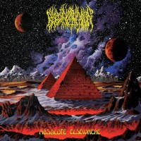
Mere days after they announced the first details of their new album, Melechesh have now revealed the cover art for the band's impending studio album, Enki. Furthermore, due to unforeseen productional issues, the release of Enki had to be pushed to February 27th (Europe), March 2nd (UK) and March 10th (US), 2015 through Nuclear Blast Records. Take a look at the intricate artwork now.
Commented mainman, singer and guitarist Ashmedi: "For the artwork we collaborated again with John Coulthart, who has done our previous two album covers. The art reflects the dynamics of the album and the world of Melechesh: order and chaos. It amalgamates several spiritual, cultural and mythological concepts from the Near/Middle East and our lyrical aspects. Again it was based in the golden ratio which for the purpose of this album seemed suitable. The pillars featured here are a continuation from the previous album and lead to a path of knowledge. John always manages to capture the essence of Melechesh."

Created by John Coulthart
Tracklist:
01. Tempest Temper Enlil Enraged
02. The Pendulum Speaks
03. Lost Tribes
04. Multiple Truths
05. Enki - Divine Nature Awoken
06. Metatron And Man
07. The Palm The Eye And Lapis Lazuli
08. Doorways To Irkala
09. The Outsiders
This marks the band's sixth full-length album and will feature guests Max Cavalera (Soulfly, Cavalera Conspiracy, Killer Be Killed), Sakis Tolis (Rotting Christ) and Rob Caggiano (Volbeat, ex-Anthrax).
The album was recorded in Greece by Giorgos Bokos (Rotting Christ) while Jonas Kjellgren (Immortal, Legion Of The Damned, Overkill, Hypocrisy) took care of the mix and mastering in his renowned Black Lounge Studios in Sweden.
Commented mainman, singer and guitarist Ashmedi: "For the artwork we collaborated again with John Coulthart, who has done our previous two album covers. The art reflects the dynamics of the album and the world of Melechesh: order and chaos. It amalgamates several spiritual, cultural and mythological concepts from the Near/Middle East and our lyrical aspects. Again it was based in the golden ratio which for the purpose of this album seemed suitable. The pillars featured here are a continuation from the previous album and lead to a path of knowledge. John always manages to capture the essence of Melechesh."

Created by John Coulthart
Tracklist:
01. Tempest Temper Enlil Enraged
02. The Pendulum Speaks
03. Lost Tribes
04. Multiple Truths
05. Enki - Divine Nature Awoken
06. Metatron And Man
07. The Palm The Eye And Lapis Lazuli
08. Doorways To Irkala
09. The Outsiders
This marks the band's sixth full-length album and will feature guests Max Cavalera (Soulfly, Cavalera Conspiracy, Killer Be Killed), Sakis Tolis (Rotting Christ) and Rob Caggiano (Volbeat, ex-Anthrax).
The album was recorded in Greece by Giorgos Bokos (Rotting Christ) while Jonas Kjellgren (Immortal, Legion Of The Damned, Overkill, Hypocrisy) took care of the mix and mastering in his renowned Black Lounge Studios in Sweden.
| nuclearblast.de | |
| Band profile: | Melechesh |
Comments
‹‹
Back to News
Comments: 20
Visited by: 123 users
| Ilham Giant robot |
| !J.O.O.E.! Account deleted |
| Auntie Sahar Drone Empress |
| !J.O.O.E.! Account deleted |
| Zap |
| X-Ray Rod Skandino Staff |
| Auntie Sahar Drone Empress |
| Sanderkill Posts: 32 |
| Gothmog_Motsham |
| In Bone Factory |
| PocketMetal Posts: 750 |
| mz |
| sbgmetal |
| Machiavelli Account deleted |
| Ilham Giant robot |
| Machiavelli Account deleted |
| angel. Evil Butterfly |
| Daniell _爱情_ Elite |
| Karlabos |
| Jaeryd Nihil's Maw |
Hits total: 3034 | This month: 6


 XD
XD
