!J.O.O.E.!
Account deleted |
!J.O.O.E.!
Account deleted
In an odd way it reminds me of De Magia Veterum's logo.
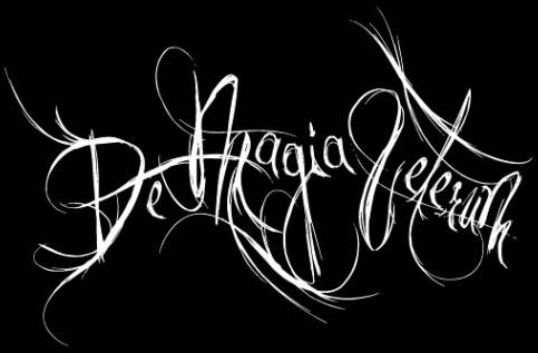
(A logo which does not fit the music, imo).
Loading...
|
X-Ray Rod
Skandino
StaffPosts: 18458  |
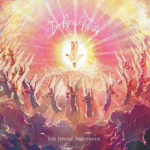
I like it a lot tbh. It looks good on this album:
----
Written by BloodTears on 19.08.2011 at 18:29
Like you could kiss my ass
Written by Milena on 20.06.2012 at 10:49
Rod, let me love you.
Loading...
|
!J.O.O.E.!
Account deleted |
!J.O.O.E.!
Account deleted
Written by X-Ray Rod on 04.07.2013 at 00:12
I like it a lot tbh. It looks good on this album:
And in turn that artwork always reminds me of this (only dark)

Loading...
|
X-Ray Rod
Skandino
StaffPosts: 18458 |
...And both are good albums!
(although that Darkthrone album is just good while The Divine Antithesis is very very good for me  )
----
Written by BloodTears on 19.08.2011 at 18:29
Like you could kiss my ass
Written by Milena on 20.06.2012 at 10:49
Rod, let me love you.
Loading...
|
!J.O.O.E.!
Account deleted |
!J.O.O.E.!
Account deleted
Written by X-Ray Rod on 04.07.2013 at 00:19
...And both are good albums!
(although that Darkthrone album is just good while The Divine Antithesis is very very good for me )
Agreed 
Loading...
|
Góral
Combo Breaker
Posts: 492  |
GóralCombo BreakerPosts: 492
Written by [user id=4365] on 03.07.2013 at 21:37
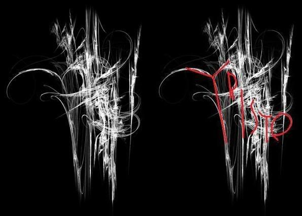
Triste. Gimme.
Mystery solved, virtual cookie for Jooe
Loading...
|
Góral
Combo Breaker
Posts: 492 |
GóralCombo BreakerPosts: 492
Written by Boxcar Willy on 03.07.2013 at 23:38
completely unreadable
Not exactly..
Loading...
|
Boxcar Willy
REEEEEEEEEEEEEEE
Posts: 9236  |
Written by Góral on 05.07.2013 at 05:13
Written by Boxcar Willy on 03.07.2013 at 23:38
completely unreadable
Not exactly..
I could also draw letters ontop of a bunch of scribbles and call it readable. Doesn't really prove your point.
Loading...
|
Marcel Hubregtse
Grumpy Old Fuck
ElitePosts: 40071  |
Written by Boxcar Willy on 03.07.2013 at 20:58
I love WITTR's logo and both of Deafheaven.
which one of WITTR?
----
Member of the true crusade against European Flower Metal
Yesterday is dead and gone, tomorrow is out of sight
Dawn Crosby (r.i.p.)
05.04.1963 - 15.12.1996

Loading...
|
Boxcar Willy
REEEEEEEEEEEEEEE
Posts: 9236 |
Written by Marcel Hubregtse on 05.07.2013 at 12:49
Written by Boxcar Willy on 03.07.2013 at 20:58
I love WITTR's logo and both of Deafheaven.
which one of WITTR?
The 05-08 one.
Loading...
|
Marcel Hubregtse
Grumpy Old Fuck
ElitePosts: 40071 |
Written by Boxcar Willy on 05.07.2013 at 14:54
The 05-08 one.
Thank God, for a second I was afraid you were going to say you really like the one as designed by the Belgian guy Christophe Szpjadel
----
Member of the true crusade against European Flower Metal
Yesterday is dead and gone, tomorrow is out of sight
Dawn Crosby (r.i.p.)
05.04.1963 - 15.12.1996
Loading...
|
X-Ray Rod
Skandino
StaffPosts: 18458 |
Written by Marcel Hubregtse on 05.07.2013 at 15:14
Thank God, for a second I was afraid you were going to say you really like the one as designed by the Belgian guy Christophe Szpjadel
The fancy looking one is a joke. I like the old one... Specially after I learned how to read it! It was quite silly... I was at Roadburn and some dude in a WITTR hoodie who was taller than me was right in front so since I didn't have anything to do I just stared at the old logo for like 10 minutes and right before the guy went out of the way I was like "Oooooooooh NOW I see it!". 
----
Written by BloodTears on 19.08.2011 at 18:29
Like you could kiss my ass
Written by Milena on 20.06.2012 at 10:49
Rod, let me love you.
Loading...
|
!J.O.O.E.!
Account deleted |
!J.O.O.E.!
Account deleted
The new WItTR logo is pretty bad. Looks a bit like Weakling's logo too, which isn't great itself.
Loading...
|
X-Ray Rod
Skandino
StaffPosts: 18458 |
Written by [user id=4365] on 05.07.2013 at 16:22
The new WItTR logo is pretty bad. Looks a bit like Weakling's logo too, which isn't great itself.
I think the old one reminds me of the weakling one, not the new one.


----
Written by BloodTears on 19.08.2011 at 18:29
Like you could kiss my ass
Written by Milena on 20.06.2012 at 10:49
Rod, let me love you.
Loading...
|
!J.O.O.E.!
Account deleted |
!J.O.O.E.!
Account deleted
Written by X-Ray Rod on 05.07.2013 at 16:27
I think the old one reminds me of the weakling one, not the new one.
Oh right, I thought that was the new one  I think that one looks like crap to be honest. The Wolves one you can actually read is decent.
Loading...
|
X-Ray Rod
Skandino
StaffPosts: 18458 |
Written by [user id=4365] on 05.07.2013 at 16:29
Oh right, I thought that was the new one I think that one looks like crap to be honest. The Wolves one you can actually read is decent.
I don't think it's that bad. Also, I found the "lin" part of Weakling almost immediately so it can't be difficult to read.
I have to say that I don't buy the Triste explanation. Like Tanner, I call bullshit on that.
----
Written by BloodTears on 19.08.2011 at 18:29
Like you could kiss my ass
Written by Milena on 20.06.2012 at 10:49
Rod, let me love you.
Loading...
|
Marcel Hubregtse
Grumpy Old Fuck
ElitePosts: 40071 |
Written by X-Ray Rod on 05.07.2013 at 16:09
and some dude in a WITTR hoodie who was taller than me ....
every single guy at Roadburn was taller than you only exception being small tiny Bas
----
Member of the true crusade against European Flower Metal
Yesterday is dead and gone, tomorrow is out of sight
Dawn Crosby (r.i.p.)
05.04.1963 - 15.12.1996
Loading...
|
Marcel Hubregtse
Grumpy Old Fuck
ElitePosts: 40071 |
Written by Góral on 05.07.2013 at 05:13
Written by Boxcar Willy on 03.07.2013 at 23:38
completely unreadable
Not exactly..
Like Tanner said anyone could draw random lines spelling out the band name in there.
----
Member of the true crusade against European Flower Metal
Yesterday is dead and gone, tomorrow is out of sight
Dawn Crosby (r.i.p.)
05.04.1963 - 15.12.1996
Loading...
|
The Demonblade
Account deleted |
The Demonblade
Account deleted
Ravencult's logo is my current favorite. It's my wallpaper! I can't post a pic as I'm experiencing a problem right now.
Loading...
|
Fritillaria
Account deleted |
Fritillaria
Account deleted
Oh suddenly I remembered that I used to love My Dying Bride logo so much
Loading...
|
Lady GaGa
Account deleted |
Lady GaGa
Account deleted
I don't know why, but this one has always been my favorite:
.jpg)
It's just plain simple yet still looking perfect for the band. It's not unreadable and is still original.
Loading...
|
Góral
Combo Breaker
Posts: 492 |
GóralCombo BreakerPosts: 492
Some incredibles:
Heron:

Bogland:

Impaled Christ:

Perverse Monastyr:

Loading...
|
Karlabos
Posts: 5775  |
----
"Aah! The cat turned into a cat!"
- Reimu Hakurei
Loading...
|
Boxcar Willy
REEEEEEEEEEEEEEE
Posts: 9236 |

Perfect.
Loading...
|
essbee
Posts: 53
|

I love this so much.
Loading...
|
telephonebear
Account deleted |
telephonebear
Account deleted
Loading...
|
Totenlieder
Posts: 274  |
Loading...
|
Ganondox
Posts: 1089  |
Naglfar

Because onion.
Loading...
|
Melkor
Posts: 117  |
Old WITTR,oak pantheon,shining(swe),summoning,caladan brood.
Loading...
|
Karlabos
Posts: 5775 |
I always thought the concept of AFoS's logo pretty cool
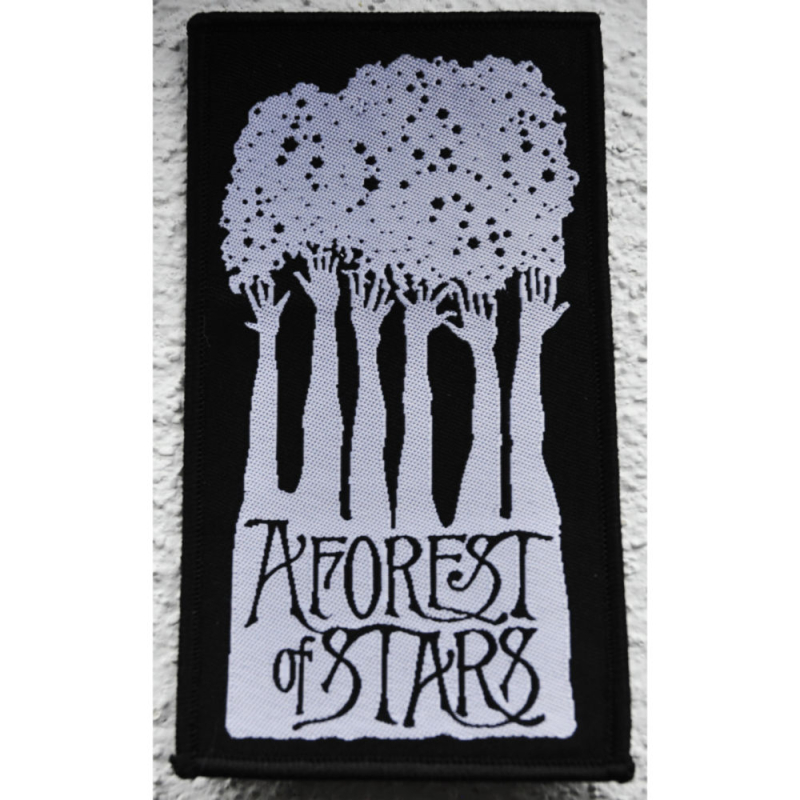
If you look at the whole thing it looks like a forest, but if you pay attention to the top area, it's actually hands reaching for the stars. Thus, "A Forest of Stars".
Quite the cute design
----
"Aah! The cat turned into a cat!"
- Reimu Hakurei
Loading...
|


