|
1.
|
Honorable mentions: |
 |
2.
|
Thundermother - Dirty & Divine
A cover that manages to be ugly but retains a certain charm in my eyes. |
 |
3.
|
Storm Death - Chaos Will Reign!
I just notice the dick-shaped ship crashed into the pyramid and now that's all I see. |
|
4.
|
List by date: |
 |
5.
|
Estuarine - Corporeal Furnace
Quite an original aesthetic, I really like this style. ⭐⭐ |
 |
6.
|
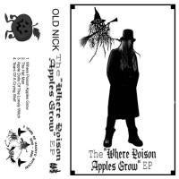
Old Nick - Where Poison Apples Grow
All his EPs are very ugly, this one manages to be slightly less so than the others. Well done. 💩 |
 |
7.
|
Pale Cremation - Communion [Soviet Tapes 1984]
I appreciate the effort the band put into the concept of this album, and the cover is on theme. However much like the aesthetic of buildings during the Soviet Union era, this cover is not very beautiful. 💩💩 |
 |
8.
|
Lumnos - Na Santa Paz Da Aurora
The cover plays too much on colors for my taste, the result is messy, really not what I like. 💩💩 |
 |
9.
|
Grafjammer - De Tyfus, De Teerling
From disgusting gray to reinforced concrete gray, a contrast of colors worthy of the greatest painters. 💩💩💩 |
 |
10.
|
Brat - Barracuda
There I think we have reached the quintessence of shit, we have fallen so low that we can only go back up. I like this kind of cover, because they're not bad in the bad sense of the word. They are bad like Turkish Star Wars is a bad movie. I can only appreciate whoever had the idea to come up with this because it was genius. 💩💩💩💩💩 |
 |
11.
|
Kryatjurr Of Desert Ahd - Rotting Crowns Of Failed Emperors Burn Atop Mountains Of Smoke And Greed
I see what they wanted to do, but I don't see how they got there. 💩 |
 |
12.
|
Bumblefoot - Bumblefoot... Returns!
I really like this flashy futuristic style. Plus this cover doesn't use too many flashy colors, just enough, and the spaceship guitar is very 80s.⭐⭐ |
 |
13.
|
Aeonist - Deus Vult
The first time I saw it I said to myself: "so here we are on the best cover of the year." And I still think that. It's a shame that the album isn't very good, the music doesn't deserves the cover for me. ⭐⭐⭐⭐⭐ |
 |
14.
|
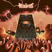
The Hellacopters - Overdriver
We are still on heavy ground with this one. The computers with one eye remind me a lot of HAL-9000. The orange clouds with the lightning provide a very cool character and the design of the giant computers attacking humanity is really great. ⭐⭐⭐⭐ |
 |
15.
|
Seventh Station - On Shoulders Of Giants
This style reminds me a lot of one of my favorite covers of one of my favorite books, the French edition of The Farseer Trilogy which includes volumes 10 to 13. If you want to see what it looks like: https:// booknode.com/lassassin_royal_deuxieme_epoque_tome_2_01583295/covers ⭐⭐⭐ |
 |
16.
|
Unreqvited - A Pathway To The Moon
Simple but powerful cover. It plays well with the contrasts of black to highlight the central element. The same cover without these contrasts and this style of drawing would not be interesting. ⭐⭐⭐ |
 |
17.
|
Noctambulist (NED) - Noctambulist II: De Droom
I rarely appreciate this style but this cover is rather unique. ⭐ |
 |
18.
|
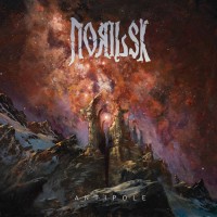
Norilsk - Antipole
The dystopian future side with an ancient ruined building in front of the colorful starry universe. It's a vibe that I appreciate. ⭐⭐ |
 |
19.
|
Lesath - Cold Silence
The giant on a small planet always reminds me of Saint Exupéry's The Little Prince. It's a style that I find elegant. ⭐ |
 |
20.
|
Black Narcissus - There Lingers One Who's Long Forgotten
Very flowery covers with lots of colors have always been among my favorites. I think the contrast with gender is good. This isn't something someone who doesn't know the genre would expect. ⭐⭐⭐ |
 |
21.
|
Naxatras - V
The covers that have a science fiction style are really among my favorites. Especially when they allow themselves a bit of originality. ⭐⭐⭐ |
 |
22.
|
Cryfemal - Puro Carbon
The collage of band members on an image is seen again and again. There is just no effort. 💩💩💩 |
 |
23.
|
Spiritbox - Tsunami Sea
I don't know what it is about modern metalcore bands that makes such simplistic covers but I really don't like it. 💩💩💩 |
 |
24.
|
Crown Magnetar - Punishment
The cover reminds me of the style of the covers of the band Deathspell Omega, which is full of very good stylistic ideas. ⭐ |
 |
25.
|
Guiltless - Teeth To Sky
Here again a modern metalcore band which adopts a minimalist style which I strongly dislike. Watch the Allt band discography to see what I'm talking about. 💩💩 |
 |
26.
|
Calyces - Fleshy Waves Of Probability
Looks a lot like a Baroness cover which is enough to appreciate it. ⭐ |
 |
27.
|
Sometime In February - Where Mountains Hide
It's not even the style, it's just that it's bad looking. 💩💩 |
 |
28.
|
The Darkness - Dreams On Toast
Even if I really like this band I must admit that their taste in terms of covers doesn't suit me very much. 💩 |
 |
29.
|
Savage Master - Dark & Dangerous
Another cover that is just poorly done. 💩💩💩 |
 |
30.
|
Pigs Pigs Pigs Pigs Pigs Pigs Pigs - Death Hilarious
It reminds me a lot of the cover of the album "Éons" by Neptunian Maximalism which I find very nice.⭐⭐⭐ |
 |
31.
|
Saetia - Tendrils
Another cover that resembles those of Baroness. The colorful and flowery covers of this style are really incredible in my opinion. ⭐⭐ |
 |
32.
|
Håndgemeng - Satanic Panic Attack
Dudes hugging each other naked? Automatically one of my favorites. ⭐⭐⭐⭐ |
 |
33.
|
Demonic Death Judge - Absolutely Launched
I don't know if it's a reference to Point Break but it's one of the covers that stand out the most for me. ⭐⭐ |