Favorite Album Art, 1960s-1990s
Favorite Album Art, 1960s-1990s

Had to break up "Favorite Album Art" into two (edit: now four!) because it couldn't handle so many words and I was losing entries at the bottom.

1.
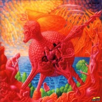
Korn
- Issues
1999 — Say what you want about nu-metal, they definitely know how to appeal. With "Toy Story 2" about to once again capitalize on heartstrings pulled by used toys, Korn jumped the gun by 8 days and came out with one of their own, straight from Sid's collection. Winner of a fan contest on MTV. (Artist: Alfredo Carlos)
|
2.
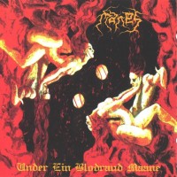
Manes
- Under Ein Blodraud Maane
1999 — Sex on covers is a rarity, even in metal, so kudos to Manes for pulling it off in an artful way. The title translates to "Under a Blood Red Moon" in Malayalam, spoken mostly in Kerala, India. This also matches its Kama Sutra vibe. (Artist: Fenomeno Design)
|
3.
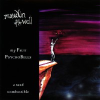
Maudlin Of The Well
- My Fruit Psychobells... A Seed Combustible
1999 — Naked guy on a ledge reaching out for a pear, pomegranate, and cherry over a dark blue abyss and purple skies. I’ll have what they’re having! The band continued this kooky minimalist style for a few more albums and this selection stands for them, too. (Artist: Toby Driver)
|
4.
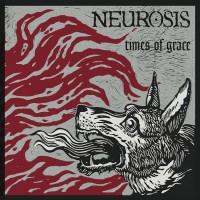
Neurosis
- Times Of Grace
1999 — For my undergrad, I attended the University of Washington, where the mascot is a Husky. Our school used many versions of huskies over the years, including a logo that looked too much like a ferret, or angry live action dogs barking on video screens during sporting events. Those are meh; something like this wood carving would’ve been better. The dog is trying to be tough but it also looks scared, as if it's about to bail back into its kennel. Feels more real, and a bit funny. (Artist: Bob McDonald)
|
5.
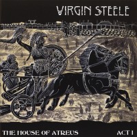
Virgin Steele
- The House Of Atreus Act I
1999 — This is actually a shield and longtime heirloom of founding member David DeFeis's family. It depicts Achilles parading around the walls of Troy with Hector's body, which partly instigated the events that the album is based on. Looks sharp.
|
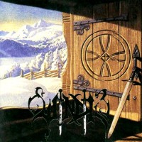
6.
Windir
- Arntor
1999 — Originally a Norwegian Fascist Party's WW2 propaganda poster that read "Toward Brighter Futures," this is a brilliant example of repurposing art. Instead of something sinister and political, I see something more personal and positive. My great-grandfather was a member of the Saami nation in the far north of Norway, and I hope his family had somewhere as cozy as this cabin to keep them warm from the snow. It's a comforting thought. (Artist: Harald Damsleth)
|
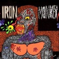
7.
Iron Monkey
- Our Problem
1998 — If you look upon this snarling, bleeding, eye-popping, syringed, nipple-nailed monkey and think, what kind of sick mind would come up with it all, well, you’re not alone! The artist, Mike Diana, became the first and possibly only artist to receive a criminal conviction for artistic obscenity in the US (in Florida, where else?). If you don’t think it’s sick, check out the fuller version with a huge penis and mutilated Jesus. If you still don’t think theres anything wrong, then I guess you’re like me. (Artist: Mike Diana)
|
8.
Lunar Aurora
- Seelenfeuer
1998 — "Aragorn, nad no ennas!" / "Man cenich?" / [eyes dart] / "The White Wizard approaches." / "Do not let him speak. He will put a spell on us... We must be quick." / [attack fails in a blinding light] / "Gandalf!" / ..."Gandalf? Oh yes. That's what they used to call me. Gandalf the Grey. That was my name... I am Gandalf the White. And I come back to you now, at the turn of the tide." (Artist: Aran)
|
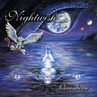
9.
Nightwish
- Oceanborn
1998 — A little cheesy, but still makes an impression. The first thing that comes to mind is Yuna in "Final Fantasy X," wading in the pool in Macalania Woods before Tidus gets there and they start making out and drowning. The big watchful eye is Kimahri lurking around and being protective. It would be cool if the makers of the game were inspired by this album. (Artist: Maria Sandell)
|
10.
Ningen Isu
- 頽廃芸術展
1998 — You know how some things are weirdly awesome, but, you know, weird, in Japan? This is exactly that. It looks like someone got super high and fiddled with a 3-D printer. To go even deeper, the album title translates to "Degenerate Art Exhibition" and is in reference to the modern art exhibits Nazis held to establish what art was not (in their twisted world view). I imagine Nazis would have "loved" this cover, in their, uh, exhibitions.
|

11.
Sear Bliss
- The Haunting
1998 — I love the sense of depth in this piece, as if the viewer tiptoed to the edge and looked down. The hawk is a nice touch, suggesting there's an opening somewhere in the upper region of the cavern. There also seems to be a person in great agony in the bottom right, like Boba Fett about to roll into the Sarlacc pit. (Artist: Kris Verwimp)
|
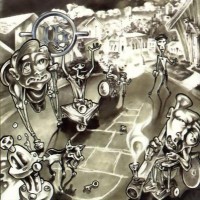
12.
16
- Blaze Of Incompetence
1997 — If physical form were to reflect one's general competence, this is what a stoner party would look like after several bong rips. Adderall weed is not. Thus, I wouldn't worry about these jabronis too much; their limbs are sure to regain functionality once the haze wears off. Love the lowbrow art style. (Artist: Gabriel)
|

13.
Anubi
- Kai Pilnaties Akis Užmerks Mirtis
1997 — A quirky expressionist painting of Death holding the eyes of the Moon, reflecting the album title (trans: "When Death Closes the Eyes of the Full Moon"). I interpret this as Death seizing an opportunity to work with total impunity, without even the world as a witness, but it's also related to the band's preference of recording music at the full moon. Tragically, lead singer and cover artist Lord Ominous met Death much too soon after disappearing during a fishing trip on Lake Michigan in 2002. (Artist: Lord Ominous)
|

14.
Dawnbringer
- Unbleed
1997 — Some of the most spiritual moments of my life have occurred under waterfalls surrounded by lush jungle. This specific scene reminds me of a recent adventure of mine in Maui, though this person seems to have found themselves a private waterfall shower. I'm not sure I've ever been that lucky. (Artist: Chris Cooper)
|
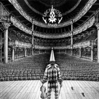
15.
Lacrimosa
- Stille
1997 — A lonely jester in front of an empty audience lends to many interpretations, but my mind goes to Werner Heldt's drawing "Parade of Zeros," as if each seat were a zero, silently absorbing the pain of the performer... This selection includes the stylistically similar but equally wonderful “Elodia” as well. (Artist: Stelio Diamantopoulos)
|
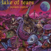
16.
Lake Of Tears
- A Crimson Cosmos
1997 — An unapologetic fantastical bonanza bursting with fun from all corners. Tell me: If you were passing through a mushroom forest, would you rather travel by frog, fish, or duck-headed wooden ship? I think I pick fish for the smooth ride, unless the cute little dog is part of the deal. Then I'd go with duck ship. (Artist: Kristian Wåhlin)
|
17.
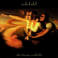
Solefald
- The Linear Scaffold
1997 — Taken from the painting "Return of the Sun" in 1986, the question is whether the three women (and the world) are experiencing a sort of rebirth as the Sun comes back, or, contrarily, are they doomed to oblivion as they reach out to the light without truly being able to see. Though I am usually a glass-half-full guy, I take the pessimistic view here, as it may be too late to atone for irreversible mistakes made to our planet in the last 150 years. (Artist: Odd Nerdrum)
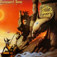
|
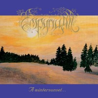
18.
Empyrium
- A Wintersunset...
1996 — This is one of those scenes that feels soft like a pillow and warm like a fresh shirt out of the laundry. Each brush simply belongs, and though it's simple nothing seems to be lacking. The blue frame and gold font are nice complements as well. (Artist: R. Reichert)
|
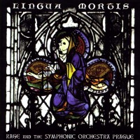
19.
Rage
- Lingua Mortis
1996 — My pick for best stained glass window cover that features religious imagery, and there are a few. (see: Abigail Williams, Enterprise Earth, Entombed). The black and white works really well as a base for the central image, which seems to feature a skeletal being taking their last communion. (Artist: Peter Dell)
|
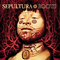
20.
Sepultura
- Roots
1996 — So much to say and so little space. The indigenous man is a member of the Karajá and first appeared on Brazil's "1000" bank note in the early-1990s. His mug is perfect for an album espousing pride in one's roots. The band even included the Xavante people in the recording process by traveling to the location of their tribe for a cultural exchange. Reportedly, the sides connected over their shared marginalization, with multiple band members claiming the experience was "life changing." Inspiring all around. My co-pick for AAOTD in the 1990s. (Artist: Michael Whelan)
|
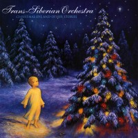
21.
Trans-Siberian Orchestra
- Christmas Eve And Other Stories
1996 — Regardless of what religion you follow, a lavishly ornamented Christmas tree can be an enchanting sight, especially when surrounded by snow on a cold winter night. I love the spotlight on the angelic child, as it's children who experience the enchantment the most. There's also an ornament in the snow, seemingly waiting for the child, so that it can be returned to the tree and made right again. Christmas isn't the same without children. Co-selected with the equally heartwarming "The Christmas Attic." (Artist: Edgar Jerins)
|
22.
Ceremonium
- Into The Autumn Shade
1995 — The view from the base of a tree trunk looking upward is an underrated perspective. The gaps between branches and leaves are like little windows to the sky, stylized artfully, in this case, as stained glass windows. If the red represents the autumnal leaves that haven’t fallen yet, our stained-glass window tree can barely provide any shade at all... but maybe that's the point. (Artist: Junia Grimaldi-Villela)
|
23.
Dismember
- Massive Killing Capacity
1995 — I'm not always a fan of excessive masculine brutality, but when I am, I want it to be the most preposterous, over-the-top nonsense to ever grace an album. As Andy Bernard once said: "I am now chopping off Phyllis's head with a chainsaw!" ...Ring-ing-ing-ing-ing. (Artist: Kristian Wåhlin)
|
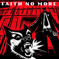
24.
Faith No More
- King For A Day... Fool For A Lifetime
1995 — You didn't ask for this, but you've now become an undesirable on the floor of the subway that needs to be removed. How does that feel? The elongation of the police team coupled with the viewer's POV creates a terror that is probably quite accurate to the perception of anyone who's been in that situation. The dog is practically lunging off the canvas, fangs out, with the color of blood everywhere. Brutal. Taken from the graphic novel "Flood," though with the police's baton cropped out. (Artist: Eric Drooker)
|
25.
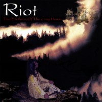
Riot
- The Brethren Of The Long House
1995 — Classy ode to the original people of NE America. An elder sits idly on a cliff with a tobacco pipe(?) and watches the fog roll in… bringing the Niña, Pinta, and Santa María along with it. Oof. I’d like to say they should’ve stayed in their long houses, but the Devil was coming right to their door. (Artist: John Macaluso)
|
26.
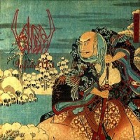
Sigh
- Infidel Art
1995 — The first of four selections from the masters of madness, featuring piles of snow shapeshifting into piles of skulls. You get a sense that the man has rushed to the balcony in paranoia, brandishing a samurai sword like a broom. To be clear, this selection is of the more appealing red, white, and blue remastered version and not the yellowish original version on MS, though both feature the same 19th-century woodblock called "Taira Kiyomori Sees an Apparition." (Artist: Utagawa Hiroshige)
|

27.
Spock's Beard
- The Light
1995 — Co-founder Neal Morse, struggling to find a record deal in the early-90s, says he “had an awakening” in a motivational course and pivoted to writing music that he loved. Most of the band’s debut album then “poured out like a breakthrough” within two weeks. Insert some color coded, fat suit-like humanoids huddled around a light like insects at night and I guess you’ve got the perfect album cover.
|
29.
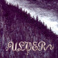
Ulver
- Bergtatt - Et Eeventyr I 5 Capitler
1995 — Sometimes simplicity is best. Cold, dark woods under an assault of falling snow... Maybe that last bit inspired Agalloch’s “Falling Snow” several years later. (Artist: Tanya "Nacht" Stene)
|
30.
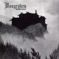
Wongraven
- Fjelltronen
1995 — Here's a lesson in cover art presentation: Carpathian Forest used the same 19th-century painting "Til Den Grønne Ridder" for their EP "Through Chasm, Caves and Titan Woods," in the same year, but partly covered the massive central structure with their own stupid logo. This version is much cleaner and really lets the painting breathe. I'd love to visit whichever Nordic location served as inspiration. (Artist: Theodor Kittelsen)
|
31.
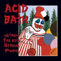
Acid Bath
- When The Kite String Pops
1994 — That's not just any clown at a birthday party (which would be creepy enough!), that's Pogo the Clown, drawn by serial killer John Wayne Gacy while he was in prison. Yes, he dressed up just like that, and yes, he buried 26 bodies under his house in Chicago in the 1970s.
|
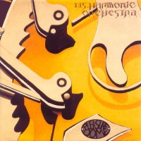
32.
Disharmonic Orchestra
- Pleasuredome
1994 — This seems to be a rather funky representation of a record player, though the tonearm and counterweight remind me of "The Hammering Man" installation near my hometown in Seattle, Washington (among other locations). Turn it 90° counterclockwise and it looks like a couple of ducks swimming in a pond. (Artist: Gerhard Klopf)
|
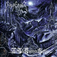
33.
Emperor
- In The Nightside Eclipse
1994 — Commonly selected by black metal fans as the greatest black metal cover of all time, it's good, no doubt, and would make J.R.R. Tolkien proud. A band of bloodthirsty orcs advance on what seems to be Minas Ithil, as the tower was renamed Minas Morgul only after orcs took over. A horseman in the style of Gustave Doré makes an appearance as well, which is a fun Easter Egg if you can spot it. (Artist: Necrolord)
|
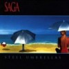
34.
Saga
- Steel Umbrellas
1994 — O' bright, peaceful beach, where art thou in my life? Never around enough. All the better if the umbrellas are steel, they won't fly away then. What do you think, cutie, wanna kick around the beach ball with me before we take a dip? (Artists: Ioannis, Penny Crichton, Stephen Jacaruso)
|
35.
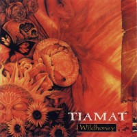
Tiamat
- Wildhoney
1994 — Honey is the lifeblood of the bee colony and that life force oozes from every corner of this piece. The Sun, sunflowers, roses, butterflies, and what looks to be a bee in pollination all populate the frame, while the yellowish orange color is so honeylike it could confuse a hungry bear. (Artist: Kristian Wåhlin)
|
36.
Buzzov•en
- To A Frown
1993 — Malnourishment of the "Night" variety, how pitiful. This guy is so skinny his left leg is actually crossed over his right, which is easily missed on first glance since there's none of the clumsiness of the large muscles to interfere. But why occupy a throne? It must be a kind of prison, and he's probably looking at whomever put him there with that odd, doglike hand posture. Something sick is possibly going on, like Ramsay Bolton kind of sick. (Artist: Harvey Bennett Stafford)
|
38.
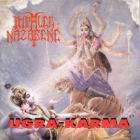
Impaled Nazarene
- Ugra-Karma
1993 — A Hare Krishna painting of the Mother Durga riding her customary tiger and offering prayers to Lord Vishnu, used without permission. I don't condone using unauthorized paintings, but according to the band's singer, the band and its record label paid a hefty fine after they were sued by a metal fan who'd converted to Hare Krishna. On top of that, they paid significantly more than a different record label in a similar situation but with a band that played less dark and "evil" music. Add in the irony that Hare Krishna, like many religious offshoots from India, aggressively emphasize a detachment from material things, and we have a situation that is so metal that I just freaking love it. The art itself looks sweet as well. My co-pick for AAOTD in the 1990s. (Artist: Madame Koslovsky)
|
39.
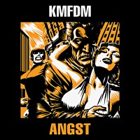
KMFDM
- Angst
1993 — If you've never heard of this band, welcome to a new visual world, where every album is a black-bordered, relatively monochromatic cartoonish square featuring fiery individuals and (mostly) five-letter album titles in block font. They're simply a blast to look through. "Angst" is my favorite for its delicious combination of sex and violence, though "Hell Yeah" is a very close second for its hilarious parody of selfie culture. Others are great too, and this selection stands for the lot of them. (Artist: Brute)
|
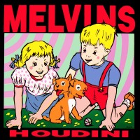
40.
Melvins
- Houdini
1993 — Hansel, Gretel, get out of there! A two-headed dog and a tiny basketball are only the beginning of your worries. The dog may look cute, but look, it already ate all of your bread crumbs. Oh, those were birds, you say? Well, fine, if you're gonna keep it as a pet, I suggest the names "Sky Pup" and "Spread Eagle Beagle." (Artist: Frank Kozik)
|
41.
Pan.thy.monium
- Khaooohs
1993 — There's an immediate beauty to this painting, though the details are slow to consciously emerge. The streaks of brown come first, dripping like maple syrup, red like autumn leaves. Then there's the blue void, around which dark figures simmer in a dim light. Finally, a concrete road, disappearing into a mountain tunnel, crowned by a boulder that looks like a skull. (Artist: Fritz Quasthoff)
|
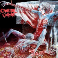
42.
Cannibal Corpse
- Tomb Of The Mutilated
1992 — Well, I want to include all kinds of covers, and nobody does gore better than these guys. Plus, I like doing the thing pictured. Co-selected with the similarly styled “Butchered at Birth.” (Artist: Vincent Locke)
|
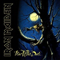
43.
Iron Maiden
- Fear Of The Dark
1992 — Maiden's first cover by someone other than Derek Riggs and they didn't miss a beat. The way Eddie "branches" out from the tree is done so perfectly that I can forgive the band's name taking up 1/3 of the cover. Gorgeous color palette as well. (Artist: Melvyn Grant)
|

44.
Melvins
- Lysol
1992 — The statue "Appeal to the Great Spirit" that has stood in front of Boston's Museum of Fine Arts since 1908 has been painted on album covers by The Beach Boys, Johnny Curtis, and the Keef Hartley Band, but this version takes the cake. The orangeish yellow tint of the sunset is a perfect complement to the man's Jesus pose, leading to an uplifting sense of spirituality. (Artist: Cyrus Edwin Dallin)
|
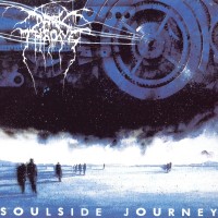
45.
Darkthrone
- Soulside Journey
1991 — At first glance, the giant machine in the sky hovering above a couple of wanderers on a bleak, arctic terrain points to a crushing industrial monotony. Save your souls y'all, escape! However, to my eye, the machine most resembles a train, and I have been on several soul enriching journeys on trains. So, take the next train y'all, live! Wonderful ambiguity and superb artistry overall. (Artist: Duncan Fegredo)
|
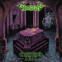
46.
Gorguts
- Considered Dead
1991 — This cover is a '90s-baby if there ever was one and vaguely reminds me of PC games from the era like "Diablo" and "Planescape: Torment." The purple is exquisite, and every nook and cranny seem fleshed out. I love the idea of the undead struggling to escape from their crypts under the watchful eye of a multi-limbed floating machine. That machine (or creature), by the way, is also featured on Suffocation's "Effigy of the Forgotten" in another custodial role. (Artist: Dan Seagrave)
|
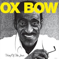
47.
Oxbow
- King Of The Jews
1991 — Sammy Davis, Jr. makes it to MS! Who would have guessed? The singer, actor, and comedian converted to Judaism in 1960 at 35, attracted by the commonalities between the black and Jewish experience. He would later help break several racial barriers on Broadway and in the entertainment industry, making the "one-eyed Negro who's Jewish" a king in my eyes. (Artist: Jim Blanchard)
|

48.
Swans
- White Light From The Mouth Of Infinity
1991 — This selection is of the two-part series of (fabulous) cover art that includes the following year's "Love of Life." We first see a bunny, equipped with a fresh carrot, standing on a heart in a beautiful meadow. The bunny is then joined on the heart by a second bunny, each equipped with droopy carrots, while their heads and most of the atmosphere is on fire. This seems to represent our utter powerlessness in the throes of love. We're poorly equipped for that fine line between picturesque and hellfire. (Artist: Deryk Thomas)
|
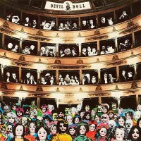
49.
Devil Doll
- Eliogabalus
1990 — Eliogabalus (sic) was a young Roman Emperor who married 5 times (one woman twice), pushed an obscure religious cult, prostituted himself, and generally caused a ruckus before he was assassinated by his grandmother. Put that circus show on stage and who do you expect to attend? That's right. A sea of creepy dolls, sad clowns, and vampires along with a bunch of sicko VIPs in the upper mezzanine. Fans of the band will recognize one of the VIPs ("The Girl Who Was... Death") in the top left corner. (Artist: Mr. Doctor)
|
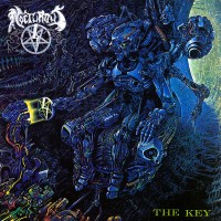
50.
Nocturnus
- The Key
1990 — Nocturnus must have seen "Terminator" and been like, yup, we're gonna one up you; forget Sarah Connor, how about a cyborg that goes back in time to assassinate Baby Jesus? The merits of that plot you can decide for yourself, but the art is one of Seagrave's best. The alien gadgetry and sea of midnight blue really create a rich tapestry for the eyes. (Artist: Dan Seagrave)
|
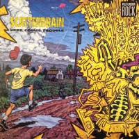
51.
Scatterbrain
- Here Comes Trouble
1990 — If Rush can claim the most intelligent triple entendre to don a cover, Scatterbrain can claim the most fun and in-your-face. Count 'em: A fella in a tub with his finger in a socket, a boy flying a kite that's caught on a power line, and a glimpse of a lightning bolt. That's 1-2-3. So, yeah, if you weren't aware, this album will attempt to electrocute you. Also love the juxtaposition of an over-the-top cartoon with an elegant realist painting. (Artist: Robert Williams)
|

52.
Seventh Angel
- The Torment
1990 — As far as album covers go, it's a shame Christianity and metal have a rocky relationship since The Bible is overflowing with potential content. In the Book of Revelation, for instance, seven angels' trumpets are sounded, hence this band's name. In Revelation 9:3, locusts emerge from the smoke of the Abyss, "and to them was given power as the scorpions of the earth have power," hence this cover's content. The artistic execution isn't shabby either. (Artist: Rodney Matthews)
|
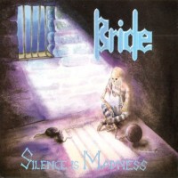
53.
Bride
- Silence Is Madness
1989 — How very sad. Makes me think of the poor souls condemned to solitary confinement, which is one of the worst punishments that could possibly be given to someone. Even worse than death after a certain number of years. Rats would probably be a welcome sight and provide some companionship. Most wouldn't even have a window. (Artist: Don Swartzentruber)
|
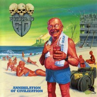
54.
Evildead
- Annihilation Of Civilization
1989 — It's nice to see social commentary about important things. Do you see how burnt red everyone is from radiation poisoning? How everyone lounges like nothing weird is going on? The guy's crazed eyes, devilish grin... That is exactly how I imagine every tanning salon. Horror factories. (Artist: Ed Repka)
|
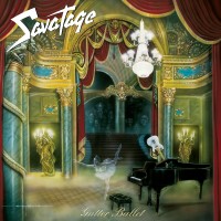
55.
Savatage
- Gutter Ballet
1989 — A visually dazzling piece that looks to be inspired by "Phantom of the Opera." The ghost of the ballet dancer, absent guitar player, skeletal candelabras, and expressive faces in the shadows all make for interesting elements. Also, I'm a fan of the artist leaving their signature as if it were a painting. (Artist: Gary Smith)
|
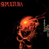
56.
Sepultura
- Beneath The Remains
1989 — Barred by their new record label from using what would later don the cover of Obituary's "Cause of Death," the band pivoted to a different Michael Whelan painting, created during a dark time in the artist's life. The simple color scheme and sense of minimalism pair together well, yet there's also so much to discover within the skull. One item, Stonehenge (which I first thought was coral), makes a second appearance on their album "Arise," establishing an interesting continuity. (Artist: Michael Whelan)
|
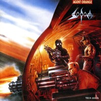
57.
Sodom
- Agent Orange
1989 — Far from warmongering, the album’s liner notes state: “This album is dedicated to all people – soldiers and civilians – who died by senseless aggressions of wars all over the world.” They did they really nail the savage aggression, though. Perhaps that is because the image is based on real photos of aircraft in the Vietnam War. I would also recommend checking out the fuller piece, where Agent Orange makes an appearance. My co-pick for AAOTD in the 1980s. (Artist: Andreas Marschall)
|
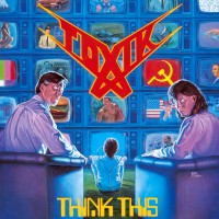
58.
Toxik
- Think This
1989 — This piece goes heavy on US, USSR, and corporate imagery to reflect the unique period of Cold War brainwashing when it was released, but it works pretty well in general for all kinds of brainwashing and groupthink. The boy is "plugged in" and totally absorbed in the TV screens, while the adults are so far gone their pupils look completely possessed. Unfortunately, none of this is "past," as the presence of digital screens, media, and malignant information has only grown since the 1980s. (Artist: Ed Repka)
|
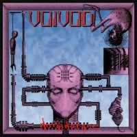
59.
Voivod
- Nothingface
1989 — What is there to say about an album cover that's strange even for a very strange discography? I have no idea how a hangman, cocoon, and upside-down zombie with bird feet are connected to a wired-up head without a mouth, but it certainly piques my curiosity. The pale purple helps, too. (Artists: Ioannis, Away)
|
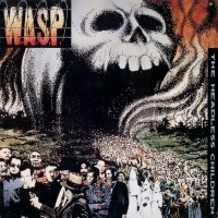
60.
W.A.S.P.
- The Headless Children
1989 — For a glam band trying to mark a shift to deeper material, W.A.S.P. really hit the ball out of the park. Based on an edgy 1942 political cartoon by Daniel R. Fitzpatrick that predicted the Nazi's defeat in Stalingrad, this version shows a series of the 20th-century's worst villains parading out of the gates of Hell. The color palette and pointillism are gorgeous as well. Really the only problem is Jack Ruby still choosing to shoot Lee Harvey Oswald when he could shoot Hitler, Stalin, or Pol Pot instead. (Artist: John Kosh)
|
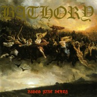
61.
Bathory
- Blood Fire Death
1988 — A mythical horde of Scandinavian riders stampede across the sky with nude Valkyries leading the charge and Thor towering above all. Epic. Originally painted in 1872, this version of the "Wild Hunt" is tailor-made for metal. The excessively large band font even seems appropriate. (Artist: Peter Nicolai Arbo)
|
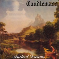
62.
Candlemass
- Ancient Dreams
1988 — Candlemass's second and third albums both feature fabulous paintings from a four-part series of the life course by Thomas Cole in the 1840s. The paintings are: Childhood, Youth ("Ancient Dreams"), Adulthood, and Old Age ("Nightfall"). I prefer this cover over "Nightfall" because there's more for the imagination, but this selection includes both. (Artist: Thomas Cole)
|
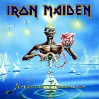
64.
Iron Maiden
- Seventh Son Of A Seventh Son
1988 — This is the Maiden cover that most captures my attention and yet I have the least answers for. Stranded in a pool of glacier water with half a body, heart in hand, and head on fire, times are tough for Eddie, though probably not as dire as "The X Factor" or "The Final Frontier." (Artist: Derek Riggs)
|
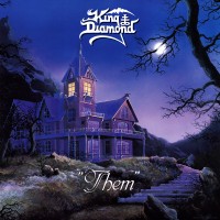
65.
King Diamond
- "Them"
1988 — A magnificent three-story mansion tucked away in the mountains with a twisting outdoor walkway and a full moon peeking through leafless trees. What could possibly be spooky about that? Strange voices, you say? Nope, not here! Not in this house! Everything is safe and normal. Look, somebody even left the light on! (Artists: Thomas Holm, Torbjörn Jörgensen)
|
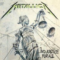
66.
Metallica
- ...And Justice For All
1988 — In some contexts, it's quite remarkable how little the world changes over time. If a cover like this were to come out today, sporting a blindfolded Lady Justice being toppled over, scales crashing, money cascading, breast exposed—it would be just as timely as it ever was. In the US especially, where political positions are bought, the Supreme Court has become partisan, and the Presidency is above the law, I feel this, and I appreciate art all the more. (Artists: Stephen Gorman, Pushead)
|
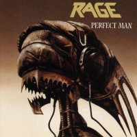
67.
Rage
- Perfect Man
1988 — Government Propagandist (GP): "In a perfect world, we would all be perfect citizens. We can agree on that, no?" Crowd: (Warily look on.) GP: "Just imagine, billions like the "Soundchaser" here! Perfectly obedient and robotic. Wouldn't that be nice?" Crowd: (Pitchforks start to rise.) GP: "A world without anger! Without conflict! Without metal music!" Crowd: (Start moshing with the propagandist at the center.) (Artist: Joachim Luetke)
|
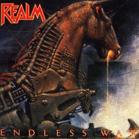
68.
Realm
- Endless War
1988 — For a representation of “Endless War,” I can’t think of a better one than the Trojan Horse. People hate being tricked or humiliated, even more than they hate being defeated. That kind of thing engenders further bitterness and conflict. Plus, the execution here is flawless. The magma leaking from its muzzle is a brilliant touch. (Chi Choni)
|
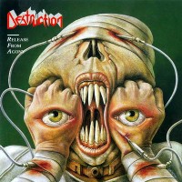
70.
Destruction
- Release From Agony
1987 — In another episode of No Idea's Original, I once thought that the Pale Man in "Pan's Labyrinth" was extremely frightening and unique. Turns out, Destruction did it first, and before them were the "Tenome" in Japanese folklore. Like Nas says, "There's nothing new under the Sun, it's never what you do but how it's done," and in this case, it's done well. (Artist: Joachim Luetke)
|
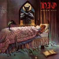
71.
Dio
- Dream Evil
1987 — Quite the nightmare! Instantly relatable for anyone who used to fear boogeymen and creepy-crawlies lurking in the shadows while they slept (so, you know, everyone). Also, R.I.P. to Murray, who never appeared again. (Artist: Steve Huston)
|
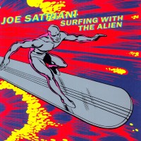
72.
Joe Satriani
- Surfing With The Alien
1987 — Licensed from the Silver Surfer Marvel comics, there's an undeniable momentum to this piece that makes it seem like the superhero is riding one of Satriani's fiery guitar riffs. It also helped cultivate a fun relationship between Satriani and Marvel, with Marvel later naming a planet after Satriani and Satriani naming a few songs after elements related to the Silver Surfer. (Artist: John Byrne)
|
73.
Fates Warning
- Awaken The Guardian
1986 — A pretty neat ode to the "Guardian of Forever" in Star Trek. In fact, in my opinion, the design of this version of the sentient portal is superior to that of the series. (Artist: Ioannis)
|
74.
Iron Maiden
- Somewhere In Time
1986 — Welcome, friends, to Easter Egg City! A futuristic place full of synths and approximately 50 little details that are either personal to the band or generally related to their discography. Some of my favorites include the clock at 23:58, the harlot in the red window, the Tardis from "Dr. Who," Icarus falling down the central skyscraper, and the street name "Acacia.” I also have a soft spot for this album since it was featured at the only Maiden concert I’ve been to. My co-pick for AAOTD in the 1980s. (Artist: Derek Riggs)
|
75.
Megadeth
- Peace Sells... But Who's Buying?
1986 — I've always had a bit of dislike for Megadeth's cheesy band font, but that doesn't matter much when the rest of the piece is this awesome. Real estate agent Vic Rattlehead leans on a For Sale sign in front of a desolate United Nations while fighter jets fly overhead. Not subtle, but with the Cold War proxy conflict in Afghanistan raging on, among various other conflicts, it might not have been a time for subtlety. Interestingly, despite the failure of the original League of Nations and an inability of the United Nations to prevent much of anything, the last 50+ years have been the most peaceful in human history. (Artist: Ed Repka)
|
76.
Voivod
- Rrröööaaarrr
1986 — Since their inception in 1982, the entirety of Voivod's very unique cover art has been provided by drummer and master doodler Michel “Away” Langevin. For this cover, Away dreamt up an extremely spiky tank that's juiced up enough to win BattleBots. Last Rites even says, "…the nostrils are hit with the pungent stench of diesel just looking at it," and I tend to agree. Also included in this selection is Voivod's debut effort "War and Pain," which sports similar subject matter and the same color palette. (Artist: Away)
|

77.
Savage
- Hyperactive
1985 — A much livelier and in-your-face version of Master Chief from "Halo." Play this album while you fight The Flood and I'm sure it will elevate the gaming experience. Maybe even create a playlist with Shadow of Intent's Halo-inspired "Primordial" and "Reclaimer" albums for a fuller effect. (Artist: Garry Sharpe)
|
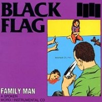
78.
Black Flag
- Family Man
1984 — Along with "Stick It In," Black Flag was feeling really provocative in 1984. "Family annihilation" is the name for this specific kind of murder-suicide among criminologists and recent statistics are rather scary. From 2020-2023 in the US, annihilations occurred about every 5 days, mostly in the South and Midwest (though only ~2/3 ended in suicide). An overwhelming number of perpetrators were males with a gun, and most were white, just like this cover. Unrelatedly, there's a caption that reads "November 23, 1963," which is the date of JFK's assassination. I'm unsure why that's there, but regardless, this is one of the most chilling covers of all time. (Artist: Raymond Pettibon)
|
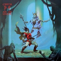
79.
Cirith Ungol
- King Of The Dead
1984 — The king of all fantasy covers and the best in the Cirith Ungol catalogue. Considering the band's penchant for LOTR, the scene first evokes the initial encounter between Aragorn and the King of the Dead. The original work, though, depicts the albino sorcerer Elric from Michael Moorcock's "The Bane of the Black Sword." Whomever you see, it's a scene that makes you want to hear the music. (Artist: Michael Whelan)
|
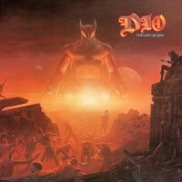
80.
Dio
- The Last In Line
1984 — The first metal vinyl I ever bought and my favorite album cover from one of my favorite bands. The way all points fade into the center horizon is unique and makes Murray all the more menacing. There are interesting small touches as well, such as the double moon or the mysterious cloaked figure sitting alone atop the right tower with an arrow pointed at their chest (straight through the heart?). "Holy Diver" gets more press and is perhaps more iconic, but this is Dio's best. (Artist: Barry Jackson)
|
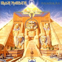
81.
Iron Maiden
- Powerslave
1984 — An absolutely magisterial composition and fresh interpretation of Eddie, whom until that point had only appeared as a humanoid with a full working body. One day, I hope to play this album in my headphones while I gaze upon the Pyramids of Giza. (Artist: Derek Riggs)
|
82.
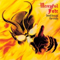
Mercyful Fate
- Don't Break The Oath
1984 — A semi-consensus choice for greatest metal album cover of all time. Personally, I wouldn't go that far, but it's so sharp that even if I knew nothing about the album, I could probably guess that it's a classic of the genre. It's like one huge, emphatic affirmation of the metal community, pointing at the crowd like: "Yeah, I see you. And we're in this together." (Artist: Thomas Holm)
|

83.
Rush
- Grace Under Pressure
1984 — For how slick and sleek this cover appears, there's little that's actually graceful. Blood drops, teeth, and an eyeball adorn the upper border, while a stormy sky, a shipwrecked plane's wing, and a whirlpool muck up the middle. What does it all mean? In the words of Kanye and Jay-Z: "No one knows what it means, but it's provocative." (Artist: Hugh Syme)
|
84.
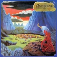
Ashbury
- Endless Skies
1983 — The wizard of Uriah Heep has a new robe and has traveled to new lands, I see. It takes me back to my travels in Peru, where I gazed down at towns like this quite often. Most memorably, a ten-year-old boy challenged me to race to the top of a hill overlooking a small village called Umasbamba, not too far from Chinchero, with a large lake in view instead of heavy forest. I did not, uh, win the race. Damn altitude. (Artist: Ernie Polo)
|
85.
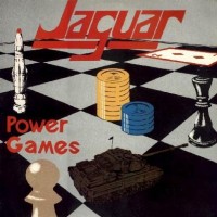
Jaguar
- Power Games
1983 — Firmly in the "it's so bad it's good" category, I feel like I could make this with just a few hours of tinkering with an illustrator program. It has its charm, though, and very much reflects the era that it's from. There's the Space Race, the Cold War, and the peak popularity of chess. (Artist: Andrew Warwick)
|
86.
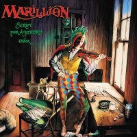
Marillion
- Script For A Jester's Tear
1983 — Excellent execution of a struggling songwriter in their living quarters, especially in the fuller painting. Heck, it even feels like I've lived there. The mattress on the ground with grubby-looking sheets and pillowcases, the crumpled papers and cluttered table, the spotted fireplace and faded walls—it's all very familiar. Other interesting objects include posters for Marillion singles, printed material like "Kerrang!" and the "Daily Mirror," lyrics for the song "Yesterday," a painting of Ophelia, the character Punch on the TV, and the sneaky inclusion of a chameleon. (Artist: Mark Wilkinson)
|
87.
Diamond Head
- Borrowed Time
1982 — Help, I can't choose: Is this epic and fantastical or tacky and sterile? While it does give me Excalibur Casino vibes, I still like it. Be sure not to miss the subtle, eponymous detail of sunlight filtering onto the diamond on the dragon's head, which... reminds me of flashy diamonds on screens of slot machines. Welp. (Artist: Rodney Matthews)
|
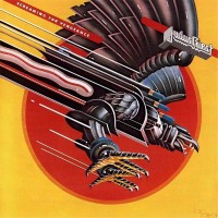
88.
Judas Priest
- Screaming For Vengeance
1982 — The first of back-to-back Priest albums to feature badass metallic beasts, with tasteful integration of the album title and an effective color palette to boot. Definitely in the running for most quintessential image in all of metal. My co-pick for AAOTD in the 1980s. (Artist: Doug Johnson)
|
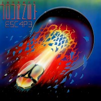
89.
Journey
- Escape
1981 — It's been a journey of sorts for the golden dung beetle; first appearing on the album "Departure," then "Captured," and finally "Escape" (then many albums thereafter). Zooming away like Jesse Pinkman in "Breaking Bad," I wonder where it's off to? If the very early example of "leet" speak (E5C4P3) can be taken as a hint, maybe it's to start a business of self-resembling computer mice. (Artist: Stanley Mouse)
|
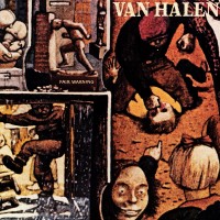
90.
Van Halen
- Fair Warning
1981 — Brutal imagery cropped from the mind of a tortured schizophrenic, originally appearing in the fuller painting "The Maze" in 1953. It's said that once these images were committed to paper, the artist was finally able to receive effective treatment for his mental illness with the help of therapists who understood him better. Quite the choice for a band who at the time had only released music with traditional glam covers. (Artist: William Kurelek)
|
91.
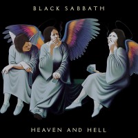
Black Sabbath
- Heaven And Hell
1980 — One of my favorite albums of all time, but never mind that, the artwork rocks too! The decision to have only black as the background was a good one, as the eye focuses in on the heavenly beings doing (arguably) hellish things and has the feel of a couple of low-wage workers passing time on their lunch break. Also, the "wrong" types of folks smoking cigarettes was so '80s, apparently, as Van Halen would later copy the idea to great effect. (Artist: Lynn Curlee)
|
92.
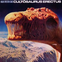
Blue Öyster Cult
- Cultösaurus Erectus
1980 — Well what do we have here? A giant, six-eyed dinosaur crossed with a giraffe crossed with the character Alien? Fresh extraterrestrial interpretations are always a fun time. And though it's unclear, with all the obstructions in the mouth area and such, I think our creature is trying to say that there needs to be more cowbell. (Artist: Richard Clifton-Dey)
|
93.
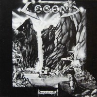
Legend
- Fröm The Fjörds
1979 — Neat cover from a band few know about. The fjords are some of the most stunning geological features on Earth, and the black and white is effective for bringing out some of that beauty. I like how the frame is interrupted by the stone the woman sits on, making her perspective effectively ours as well. (Artist: Ioannis)
|
94.
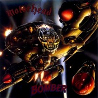
Motörhead
- Bomber
1979 — Awesomely gaudy and in-your-face, just like the explosive riffs they hit you with. What's illustrated is the three musicians as gunners in a Heinkel 111 bomber, which the Nazis used during The Blitz. Why something Nazi, you ask? Lemmy: "The bad guys make all the best shit." (Artist: Adrian Chesterman)
|
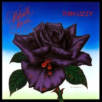
95.
Thin Lizzy
- Black Rose: A Rock Legend
1979 — “Black Rose” is a nickname of sorts for Ireland, the beloved homeland of band leader Phil Lynott. The actual rose seems more like a lush, deep purple, which is a plus. Then the bloody petals make it feel just a little more metal, and it all stands out against a soft background that reminds me of the flag of Uzbekistan. Another winner from Mr. Fitzpatrick. (Artist: Jim Fitzpatrick)
|
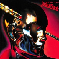
96.
Judas Priest
- Stained Class
1978 — Really unique shine, with reds, blues, and metallics all swimming around, and it almost feels like you can see your own reflection. This was also the debut of Priest's famous band script, which I later used to design my high school's tennis uniforms in my senior season. (Artist: Rosław Szaybo)
|
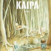
97.
Kaipa
- Solo
1978 — As a former young boy, this is a delightful scene. Reminds me of making a fort at summer camp when I was 10. Our group leader, "Jumbo," let us skip arts and crafts to go off campus into the woods. Apparently he had just got out of a coma... funny how I still remember that. Cute and cozy art style, too. Really reflects the slenderness of Swedish forests. (Artist: Lars Holm)
|
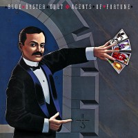
98.
Blue Öyster Cult
- Agents Of Fortune
1976 — I've seen this cover 100 times and always thought it had a classy look. The man's got a dapper outfit and a formidable 'stache, and I'm a fan of how he displays the tarot cards. However, it wasn't until doing this list that I noticed his off hand is pointing at the band's logo on the wall. (Artist: Lynn Curlee)
|
99.
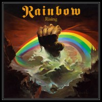
Rainbow
- Rising
1976 — This cover was my first indication back when I was a teenager that there might be something special about the artwork in metal. It’s the kind of art that would have made me buy the album in the record store on impulse, had I lived back then. My pick for AAOTD in the 1970s. (Artist: Ken Kelly)
|

100.
Thin Lizzy
- Jailbreak
1976 — Another Marvel-inspired cover for Thin Lizzy, this time featuring a Fantastic Four all-for-one and one-for-all kind of vibe. The silvery metallic sheen makes an impact right away, and the more you look, the more super-charged it all becomes. (Artist: Jim Fitzpatrick)
|
101.
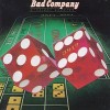
Bad Company
- Straight Shooter
1975 — A simple yet snazzy cover that really grabs your attention. I'm not a huge gambler, but I do enjoy a game of craps with a group of friends. Roll a 5-6 at the beginning of the round, for instance, and (most) everyone at the table wins, which is fun! (Artist: Hipgnosis)
|
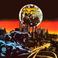
102.
Thin Lizzy
- Nightlife
1974 — An awesome ode to Marvel comics and Black Panther long before it was popular; in fact, as a veiled political statement in support of civil rights and black power, it may have been even a little unpopular at the time (or at least edgy). The color palette is just gorgeous as well. It gives the city a Gotham-type quality under the dark side of the Moon. (Artist: Jim Fitzpatrick)
|
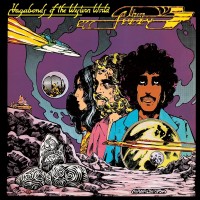
103.
Thin Lizzy
- Vagabonds Of The Western World
1973 — It's hard not to appreciate Thin Lizzy's range. A band from Ireland, with a black lead, that sings about the American West? Yowzah! And they manage a hippy, spacey vibe with this cover, despite rocking out super hard. Far out. Bonus points for the purple. (Artist: Jim Fitzpatrick)
|

104.
Blue Öyster Cult
- Blue Öyster Cult
1972 — Mesmerizing use of black and white; it's easy to get lost in the blanket of stars and the infinitely repeating rectangular spaces. The latter part actually reminds me of Berlin's Memorial to the Murdered Jews of Europe (of all things!), even though the designs aren't quite the same. (Artist: Bill Gawlik)
|
105.
Jethro Tull
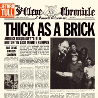
- Thick As A Brick
1972 — I have a soft spot for newspaper layouts since my father has read "The Seattle Times" or some other newspaper just about every day for as long as I've been alive. It's crazy to think that soon kids won't even be able to identify what it is. "The St. Cleve Chronicle and Linwell Advertiser" is a spoof of small-town English papers and all content is predictably silly and written by band members. (Layout Designer: Roy Eldridge)
|
106.
Uriah Heep
- Demons And Wizards
1972 — The primordial fantasy cover on MS. It features a quirky fellow dressed in a robe of butterfly wings shooting magical bubbles along the way to a tree atop a waterfall. Quite a whimsical beginning for the genre. (Artist: Roger Dean)
|
107.
Jethro Tull
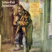
- Aqualung
1971 — This ragged and rabid-looking vagabond based on lyrics in the title track has secured a place in rock history, and in this list, but has not, apparently, benefitted the artist’s family very much. The product of a $1500 handshake agreement 7 years before a major update to US Copyright Law, Burton Silverman has tried, and failed, to receive any further compensation after the massive success of the album. This includes reaching out to very a pompous and unhelpful Ian Anderson, according to Silverman’s son in an article that I would recommend to anyone interested. (Artist: Burton Silverman)
|

108.
The Jimi Hendrix Experience
- The Cry Of Love
1971 — I’m a Seattleite so I’m biased, but I find this cover to be fairly emotional. The black and blue tones create a somber mood while also paying tribute to Jimi's dark and frizzy features. A great deal of the weight of his passing is packed into those squiggly lines. (Artist: Nancy Reiner)
|
109.
Iron Butterfly
- Metamorphosis
1970 — In college, I had to read Ovid’s “Metamorphoses,” and I feel this should have been the book's cover. It probably would have made the reading a lot more interesting. Superb use of color. (Artist: Roger Webster)
|

110.
King Crimson
- In The Wake Of Poseidon
1970 — You have to hand it to New Age writer Richard Gardner; he really came up with an airtight framework for elevating our consciousness. The "12 Archetypes" of the human personality, each represented by a face (see the fuller artwork), encompass all that it is to be human. You know, 6 white guys and 3 white ladies, plus a sad Persian girl, a black slave, and Mother Nature. Totally encompassing! ...Well, maybe not, maybe it's all poppycock, but the art sure looks cool. (Artist: Tammo De Jongh)
|
111.
King Crimson
- Lizard
1970 — An absolutely stunning medieval themed layout that follows the album's lyrics, one letter of the band at a time. Contemporary figures make an appearance as well, including Peter Gabriel, Jimi Hendrix, and The Beatles. I could imagine myself having a ball looking it over if I stumbled upon it in a record store in the 1970s. (Artist: Gini Barris)
|
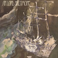
112.
Sir Lord Baltimore
- Kingdom Come
1970 — Scratchy yet sublime, with a sharpness and color that don't come across in the MS thumbnail. I have no idea which kingdom they're off to, but the skeletal makeup of the vessel and its crewmates reminds me of the underwater pirates in "James and the Giant Peach." That scene freaked me out as a kid. (Artists: Doug Taylor, John Craig)
|
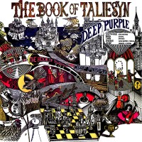
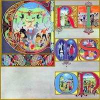
113.
Deep Purple
- The Book Of Taliesyn
1968 — Playing off the theme of Arthurian poetry and a real 6th-century Welsh bard named Taliesin, this is a stupendous mess. We've got over five repetitions of the band name or album title, four castles, three groups of troubadours, two lute players, a jester, a chess game, and a partridge and a pear tree (not really, but there are animals and some shrubbery!). It's a shame this artist never did another cover. (Artist: John Vernon Lord)
|
Disclaimer: All top lists are unofficial and do not represent the point of view of the MS Staff.
[ More lists by purplejesus ]
[ More lists by purplejesus ]
Comments
Comments:
2
Visited by
12 users
 Posts: 2781 |
 Posts: 6631 |

Hits total: 368 | This month: 11